Illustrator, Photoshop
2019
Back To Lisbon Hostel Logotype
Partnership
WIZZIC
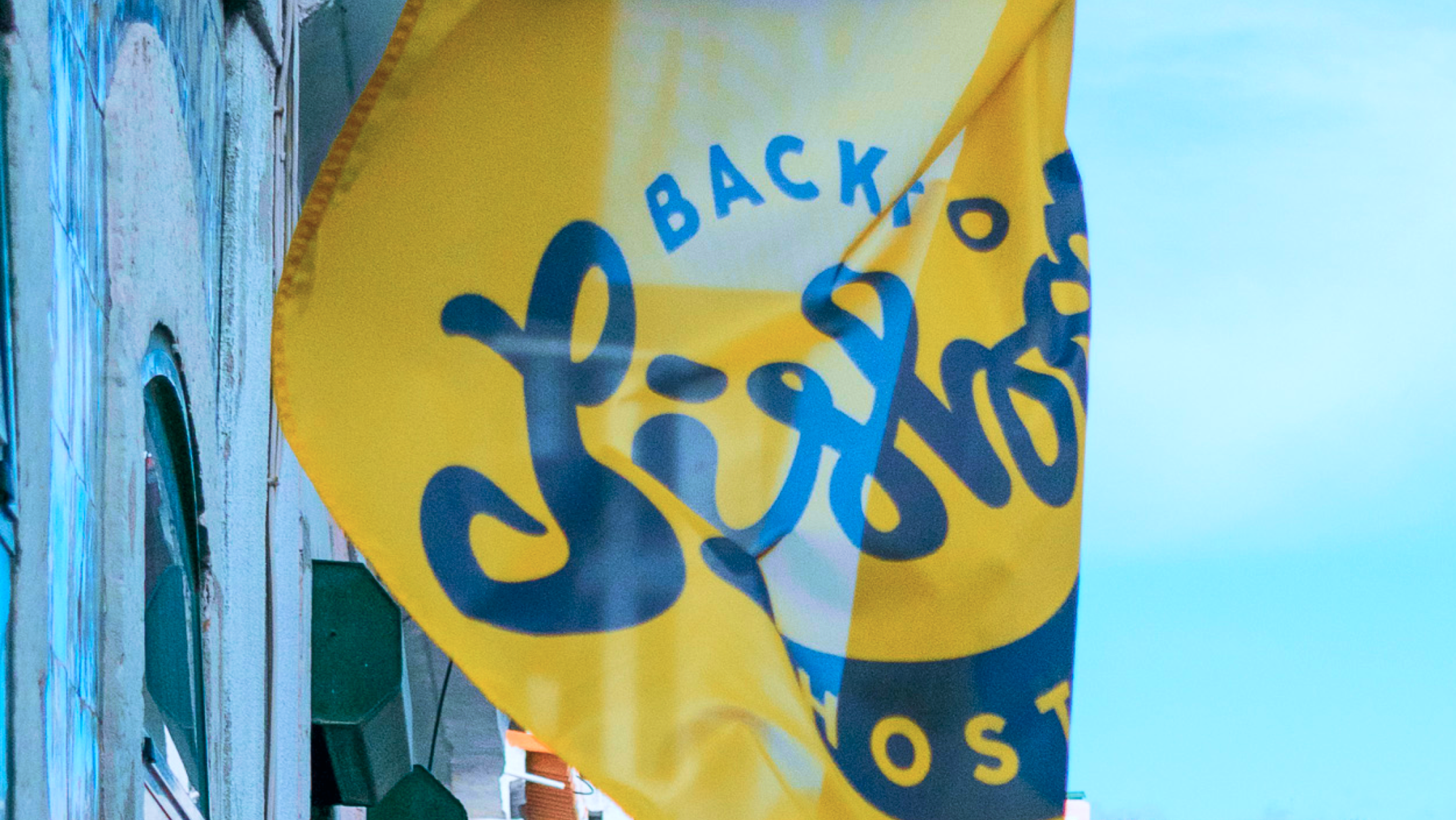
Back to Lisbon Hostel is a friendly lower-priced inn for backpackers, with social areas and a sunny terrace.
Color & expression
Objective
The main goal was to design a logotype for a new budget hostel in the city of Lisbon.
And the owners request, as simple as it could be:
“We need a happy logo for our brand new business in the heart of Lisbon... to be applied on the website, social media, and signage”.
And the owners request, as simple as it could be:
“We need a happy logo for our brand new business in the heart of Lisbon... to be applied on the website, social media, and signage”.
Solution
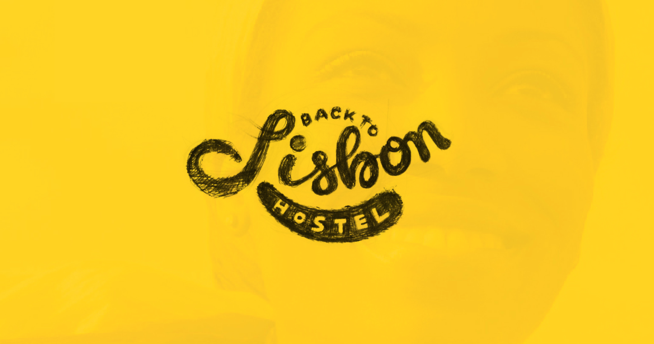
A smile! An eye-catching custom hand-drawn logo that has a relevant meaning to its audience.
The “yellow says hello” to the people, bright colors and “flavours” of the city, are some of the memories recalled in the happy faces of those who visited Lisbon.
The “yellow says hello” to the people, bright colors and “flavours” of the city, are some of the memories recalled in the happy faces of those who visited Lisbon.
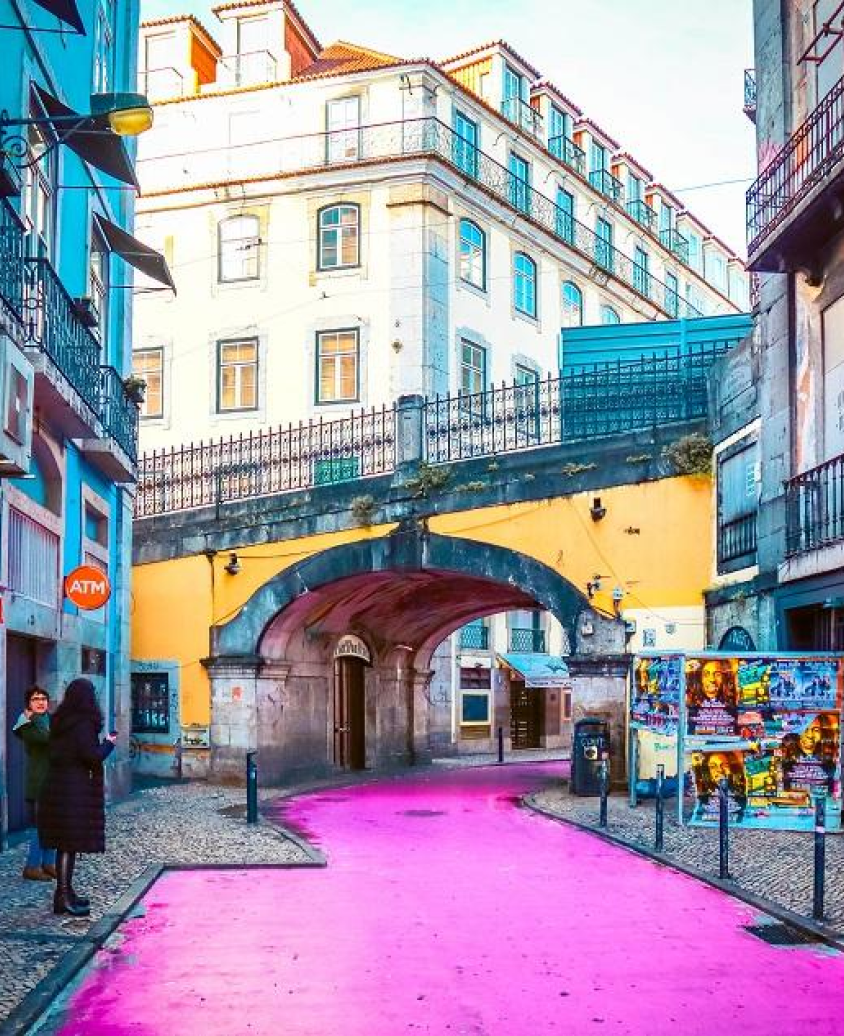
One of the sunniest city in Europe
Some of Lisbon best experiences are in the everyday – spectacular 7 hilltop vistas around city, colorful streets, pleasant year-round weather and friendly locals.


︎︎
Black & Yello!
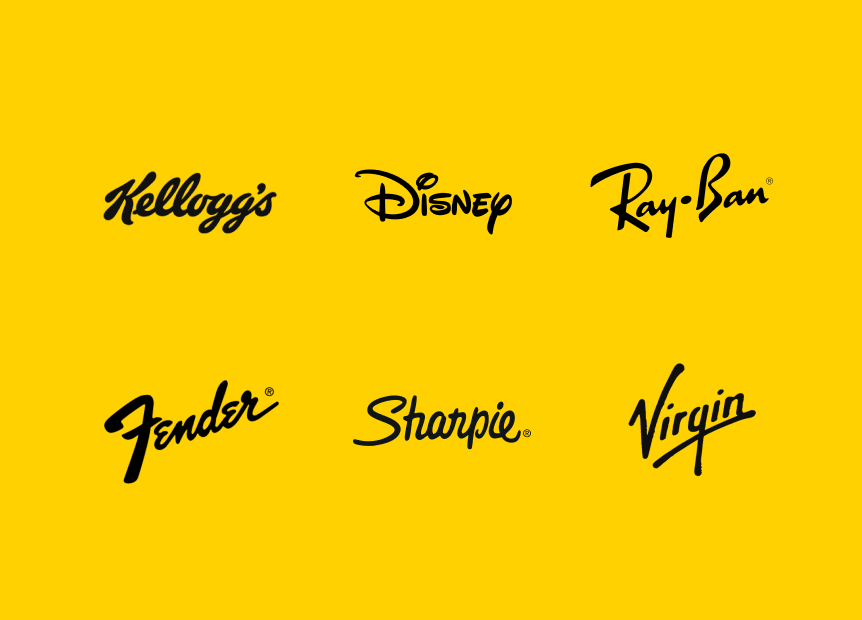
Hand-drawn implies authenticity and simplicity.
People relate better with designs that appear to have been drawn by a real person.
Typography is already expressive, distorting and stretching extends that idea further, and the brands that has expression, engage better with their audience.
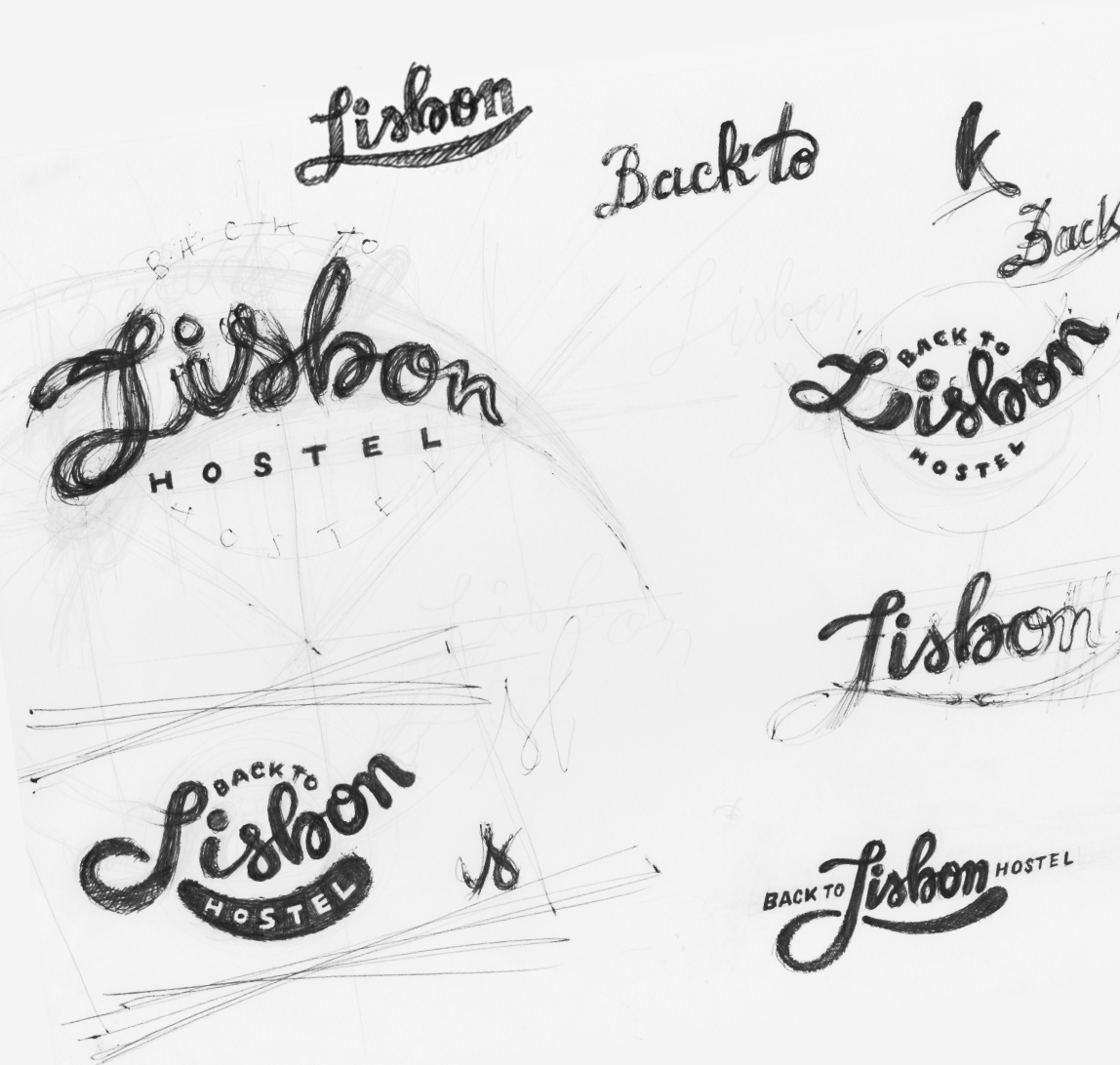

The Hostel opened in July 2017 in a restored building dating from 1939 with ornaments and beautiful white, blue and yellow tiles.
And the logo was applied in couple of outdoor signage and offline communication.

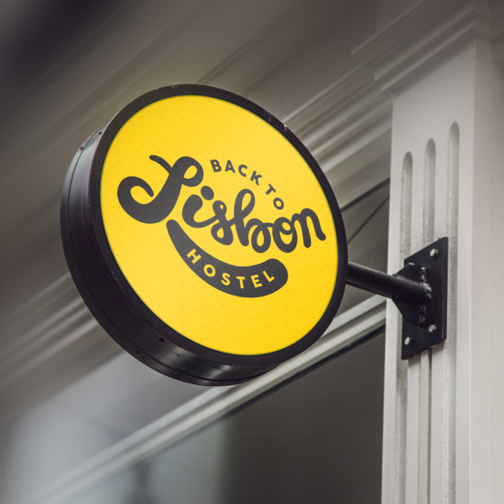
Applications examples
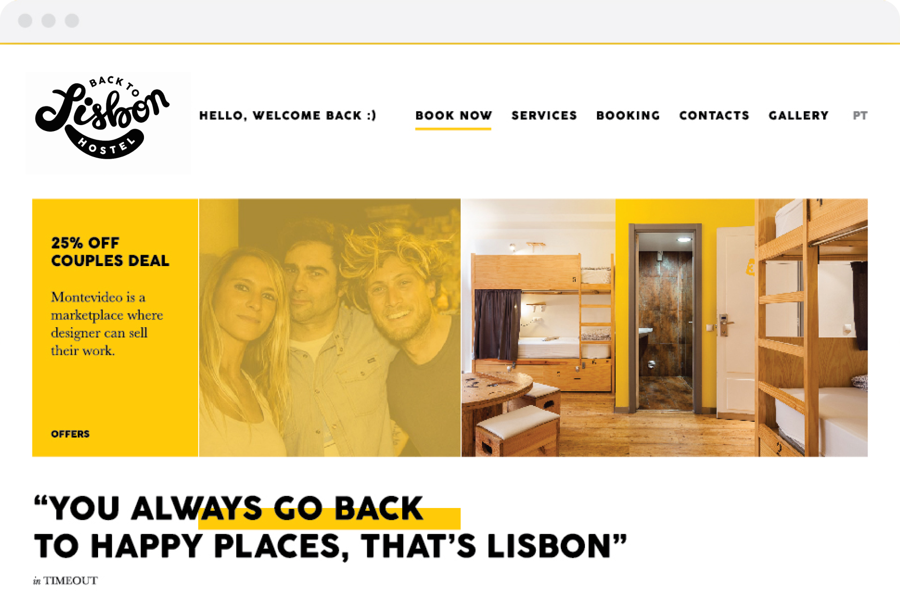
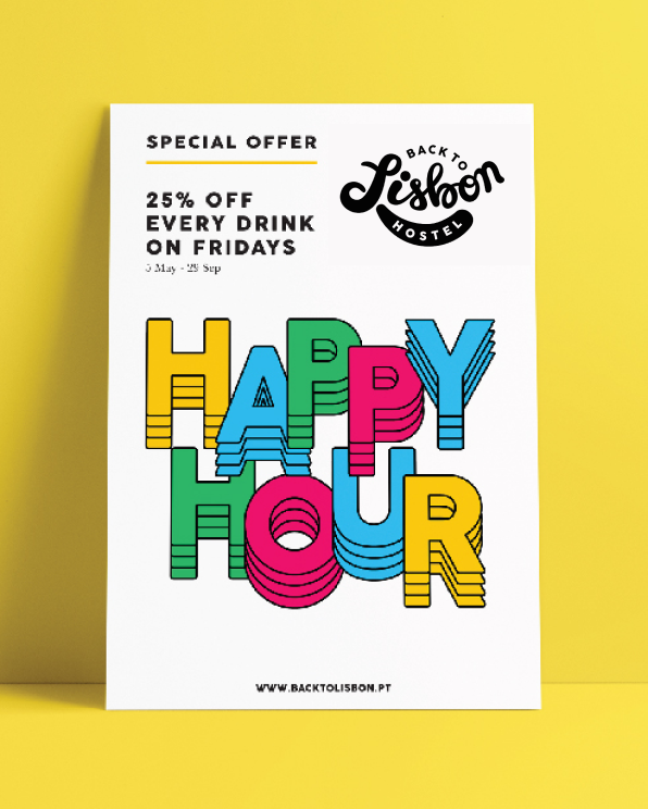
Happy Identity
The playful concept inspired a straightforward lettering visual identity to suit both online and offline materials and applications.
Vivilde℠ • UI/UX Designer currently based in Lisbon, helping brands and businesses interact better with their audience. About ︎