Illustrator, Photoshop
2024
Telecable Inc Rebrand
Partnership
Code-495
Telecable Inc is a company based in New Jersey providing full “turnkey” telecommunications services across 24 states of USA.
Connect to the future
Objective
Since 1995, New Jersey-based Telecable has been a reliable partner. They build and maintain communication infrastructure for reliable connectivity, committed to innovative solutions and guided by their motto, "Connecting People, Connecting the Future."
The main goal was to build a strong identity aligned with the new brand visual statements that inspires investor confidence and positions them above competitors.
The main goal was to build a strong identity aligned with the new brand visual statements that inspires investor confidence and positions them above competitors.
Solution
The new identity embodies the brand's integration with cable and line construction services, highlighting growth in the utility industry through Telecable Inc's commitment and strategic investments in its team and operations.
Telecable Inc Innovative Logotype
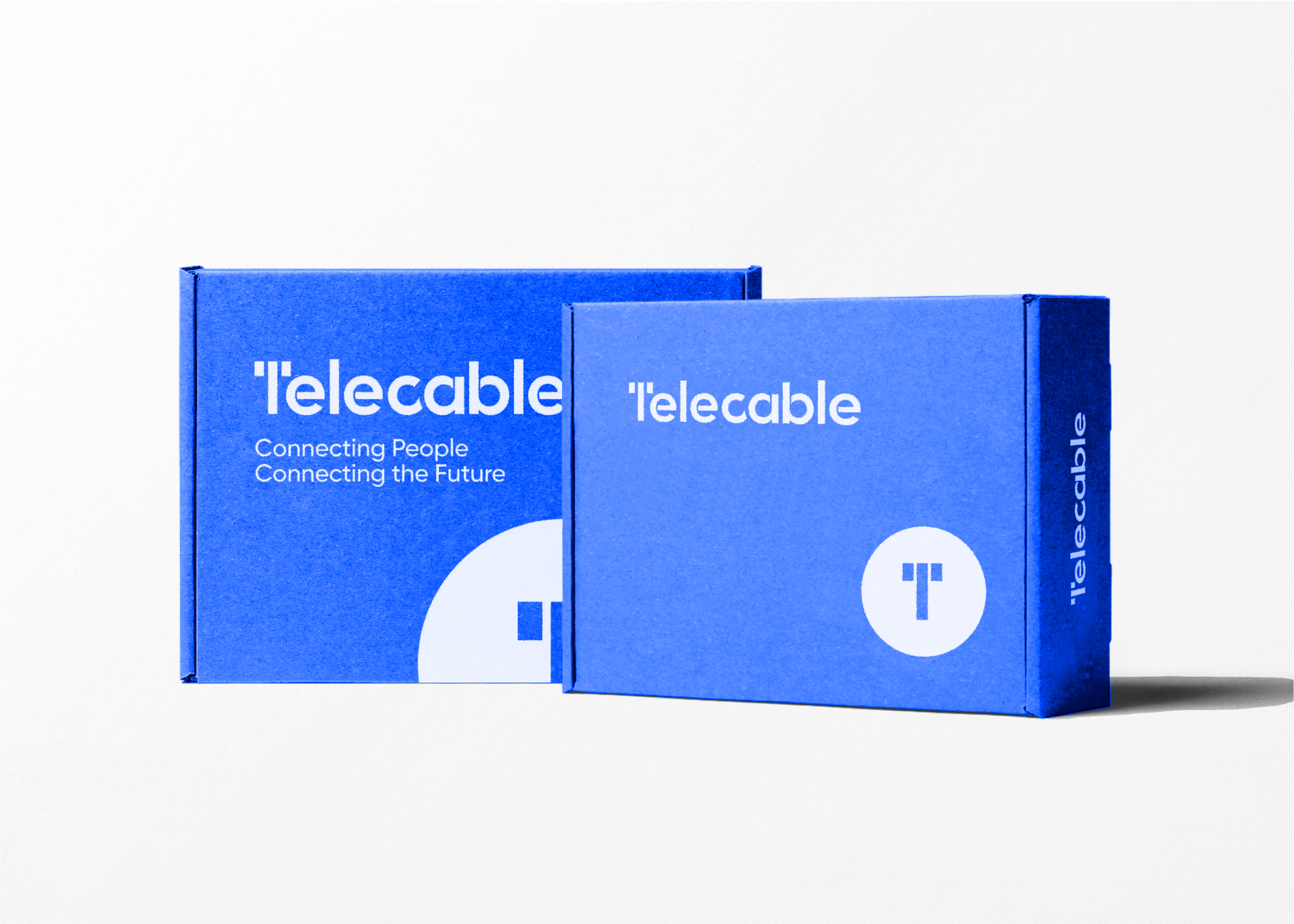
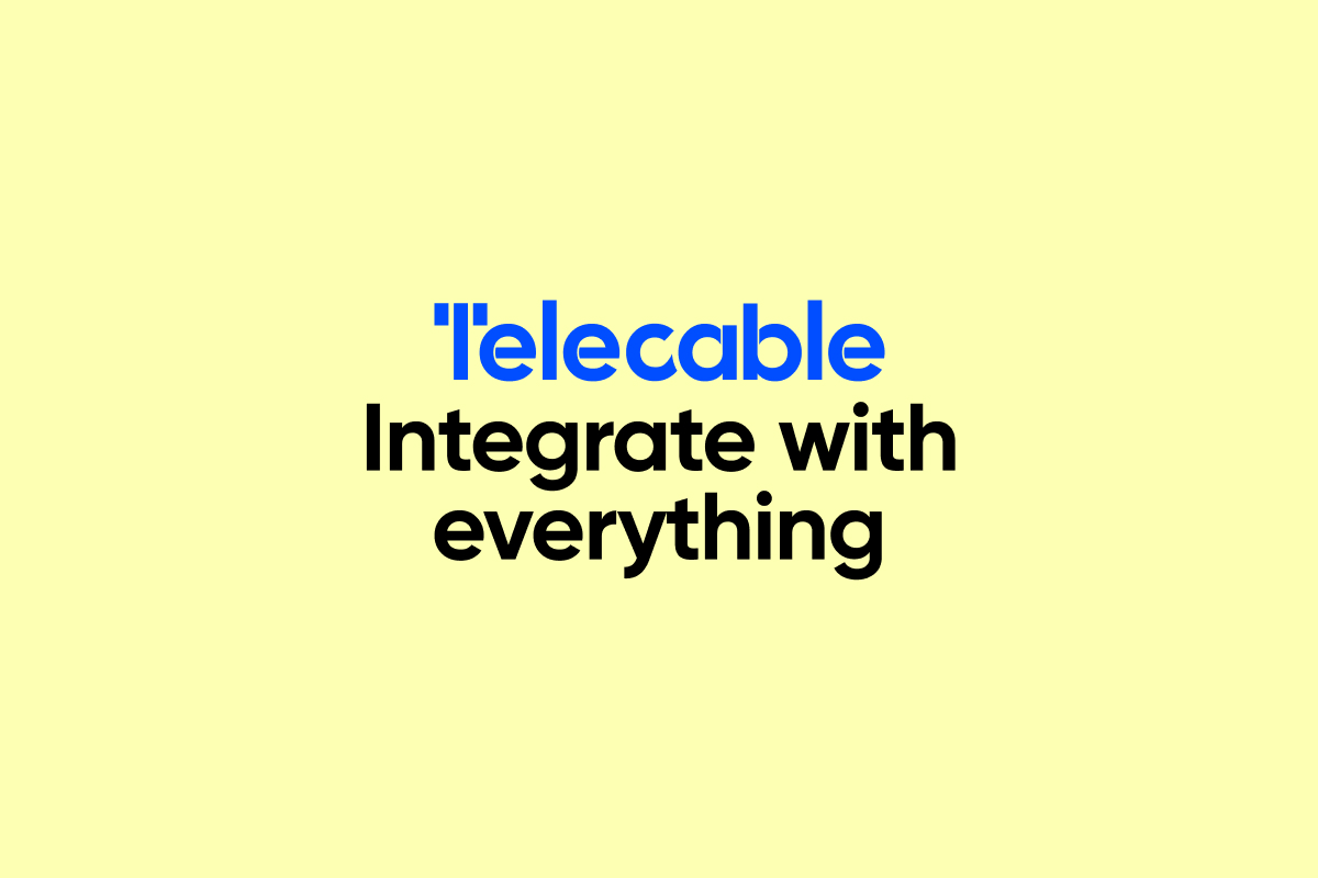
Telecable Inc business uses a logotype as the main brand element, while the circular logomark acts as a visual shorthand for the brand, making it memorable and easily distinguishable. The tagline encapsulates Telecable's mission to bridge gaps in communication and technology.
Executed in a customised bold sans-serif typeface with the letter "T" split into three parts, referring to telecom and the physical aspects of the core business such as, utility pole, wire or cable used for transmitting signals, data, or power.

Logo
Design
The Telecable Inc logo is a straightforward symbol of innovation and progress, featuring a streamlined and contemporary look that reflects the commitment to simplifying complex telecommunications solutions for Telecable’s partners.
In a telecom event, a unique and impactful identity can set a brand apart from its competitors, attracting and retaining customers by emphasizing its distinct qualities.
In a telecom event, a unique and impactful identity can set a brand apart from its competitors, attracting and retaining customers by emphasizing its distinct qualities.

Color
Palette
The logo features primarly a vibrant palette of blue and white, conveying professionalism and trust.
Secondary colors like light yellow and dark blue enhance readability and visibility, highlighting Telecable's innovative nature.
Secondary colors like light yellow and dark blue enhance readability and visibility, highlighting Telecable's innovative nature.
⬤
In symbolism “blue ribbon” is the term used to describe something of high quality.
#004EFF
0, 78, 255
100, 69, 0, 0
2132 C
⬤
Bright White
Clean and clear white shade, is used to convey light and simplicity.
#FFFFFF
255, 255, 255
0, 0, 0, 0
11-0601 TCX
Blue Ribbon
In symbolism “blue ribbon” is the term used to describe something of high quality.
#004EFF
0, 78, 255
100, 69, 0, 0
2132 C
⬤
Bright White
Clean and clear white shade, is used to convey light and simplicity.
#FFFFFF
255, 255, 255
0, 0, 0, 0
11-0601 TCX
⬤
Vibrant and cheerful yellow, associated with warmth and positivity.
#FDFFB2
253, 255, 178
1, 0, 30, 0
Yellow 0131 C
⬤
The color of the deepest midnight sky, adds depth and sophistication.
#001952
0, 25, 82
100, 70, 0, 68
2757 C
Portafino
Vibrant and cheerful yellow, associated with warmth and positivity.
#FDFFB2
253, 255, 178
1, 0, 30, 0
Yellow 0131 C
⬤
Stratos
The color of the deepest midnight sky, adds depth and sophistication.
#001952
0, 25, 82
100, 70, 0, 68
2757 C
Typeface
Gilroy is a modern sans-serif typeface known for its geometric structure and clean lines, with smooth curves and balanced proportions that enhance readability and aesthetic appeal.
Gilroy UltraLight
Gilroy Light
Gilroy Regular
Gilroy Medium
Gilroy SemiBold
Gilroy Bold
Gilroy Black
Gilroy Heavy
Gilroy
Gilroy Light
Gilroy Regular
Gilroy Medium
Gilroy SemiBold
Gilroy Bold
Gilroy Black
Gilroy Heavy
Gilroy
AaBbCcDd
AaBbCcDd
AaBbCcDd
AaBbCcDd
AaBbCcDd
AaBbCcDd
AaBbCcDd
AaBbCcDd
AaBbCcDd
AaBbCcDd
AaBbCcDd
AaBbCcDd
AaBbCcDd
AaBbCcDd
AaBbCcDd

Game-changing
identity
Telecable’s new visual identity is a significant advancement, highlighting people to emphasize connectivity and innovation. The clean and vibrant colors enhance brand recognition, while the modern design across all platforms supports Telecable's goal of improving communication and advancing technology.

⬤⬤
LinkedIn
Profile
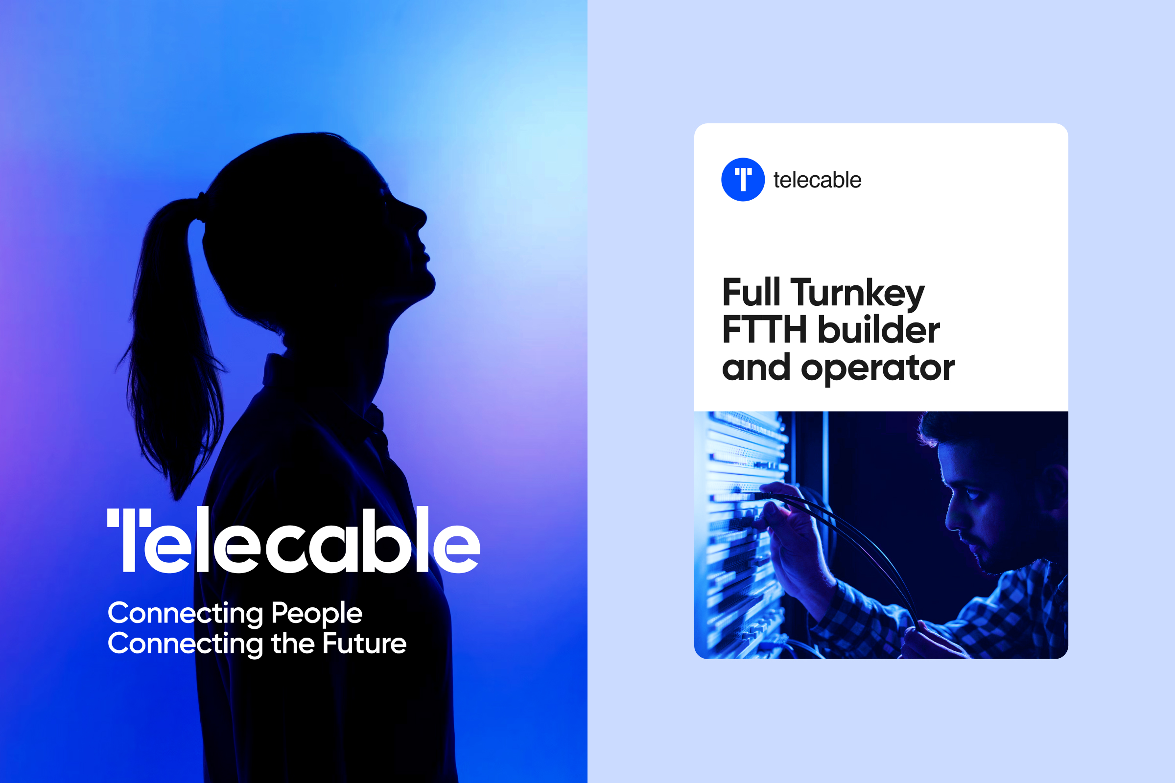
We have kept the cover clean and balanced, focusing on the logo and header image with cohesive colors and fonts, and use of humanized imagery.

Online
Posts
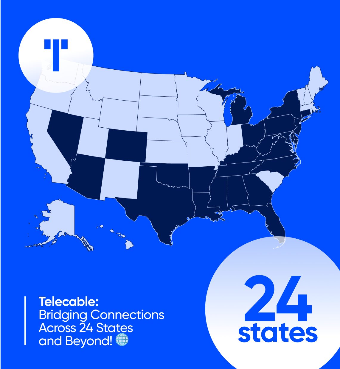
For LinkedIn posts, we kept prominently the most valuable and virtuous elements from the Telecable’s identity - the blue color and the circular mark to ensure brand consistency.
The mark "T" subtly integrated into the background reinforces brand identity while maintaining a sleek, modern look.
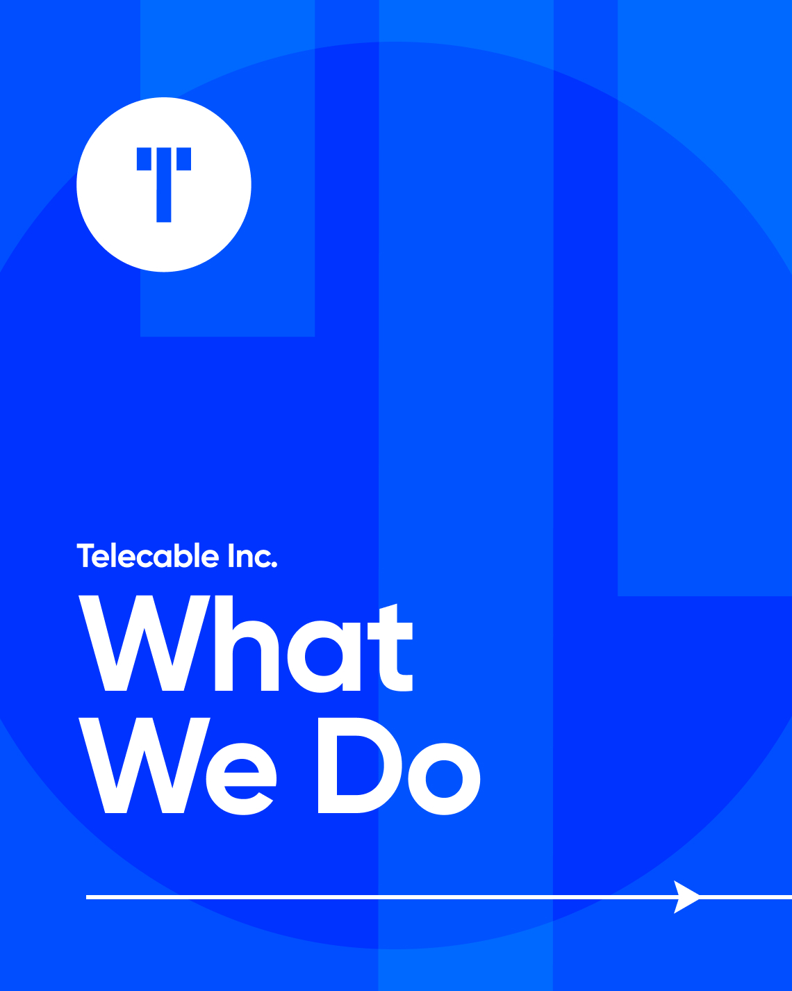
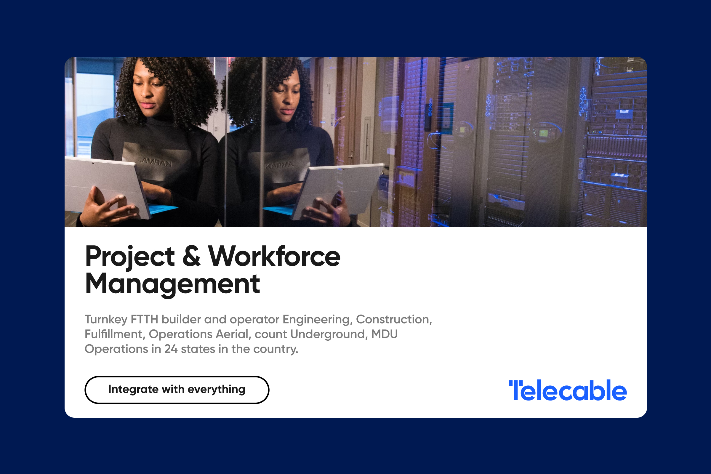
Overlayed images and semi-transparent blue filter that match the brand color palette, paired with the main logotype.

Stationery Items
Telecable's desk supplies reflect its modern and professional brand through cohesive design and intentional use of colors and typography.


RTIME 2024
Telecable Inc.
at RTIME 2024
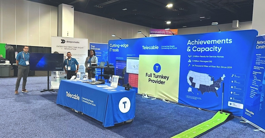
A team of managers, tech experts, and sales representatives have taken part in RTIME 2024 Tampa - Florida, leading the fight for a bright broadband future.
The new brand identity made a strong visual impact, showcasing Telecable’s commitment to innovation and connectivity.
Vivilde℠ • UI/UX Designer currently based in Lisbon, helping brands and businesses interact better with their audience. About ︎