TWISPER Busines Case Study
Thoughtful details
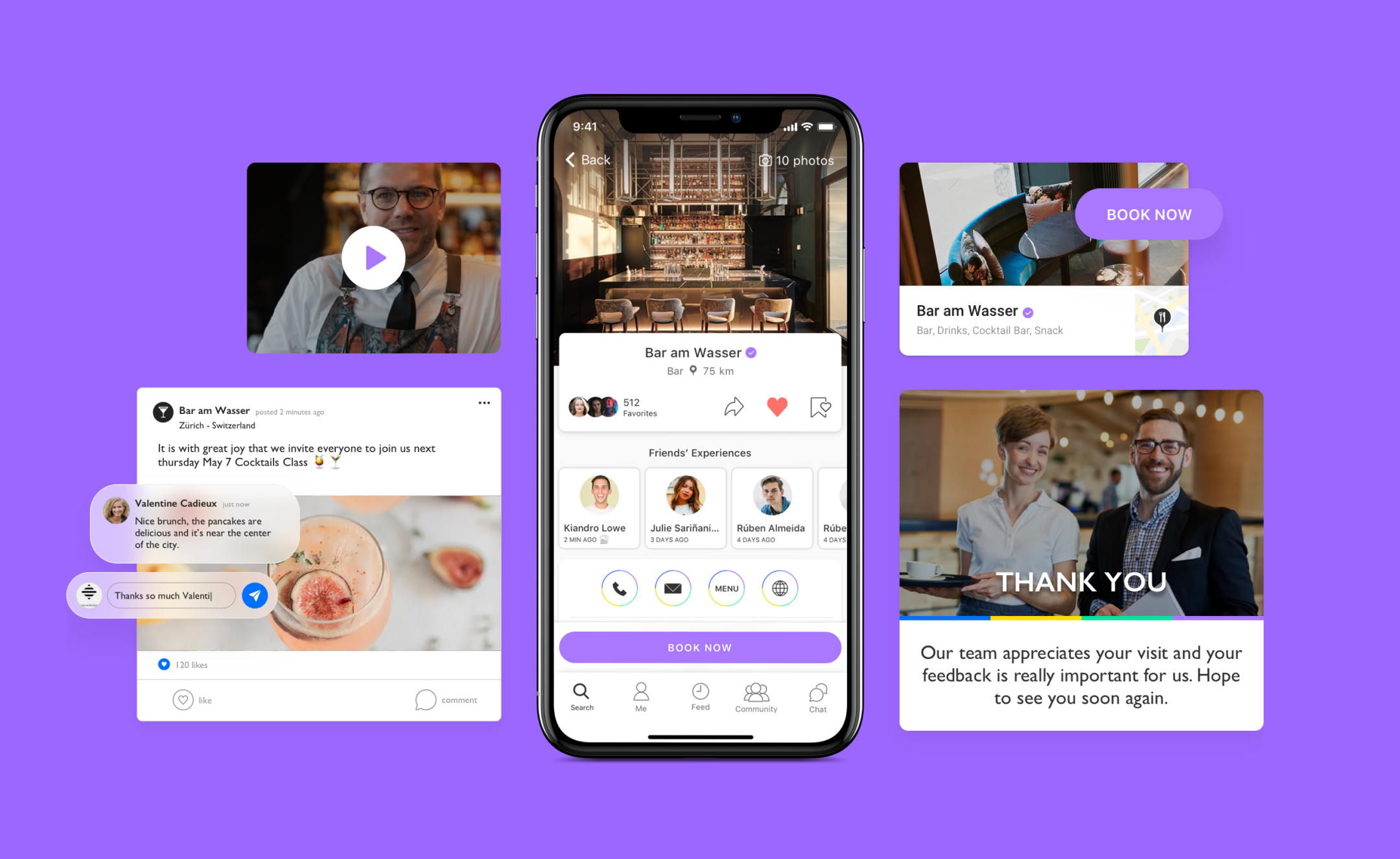
The B2B products aim to attract new business, by impressing stakeholders and connecting with the TWISPER Business audience.
Non-relatable content and distinct visuals were eliminated, in order to keep the homepage and platform aligned with TWISPER App and clutter-free.
Non-relatable content and distinct visuals were eliminated, in order to keep the homepage and platform aligned with TWISPER App and clutter-free.
Match B2C and B2B UI

Consistency and clarity
We started optimizing the site structure and design system aligned with the TWISPER B2C site.
And also made a better hierarchy of information and improve overall contents — text and images.
And also made a better hierarchy of information and improve overall contents — text and images.
TWISPER CTA’s Buttons
High emphasis buttons retains more attention, and the arrangement of elements clearly convey that other buttons are less important.
B2C buttons
![]()

B2B buttons
![]()


1. Highest emphasis action / 2. High emphasis action / 3. Low emphasis action
Site updated pages
Home
Hero images help draw attention, provide context about content, or reinforce a brand.
All images that were unrelated to the users' goals were relocated.

Success Stories
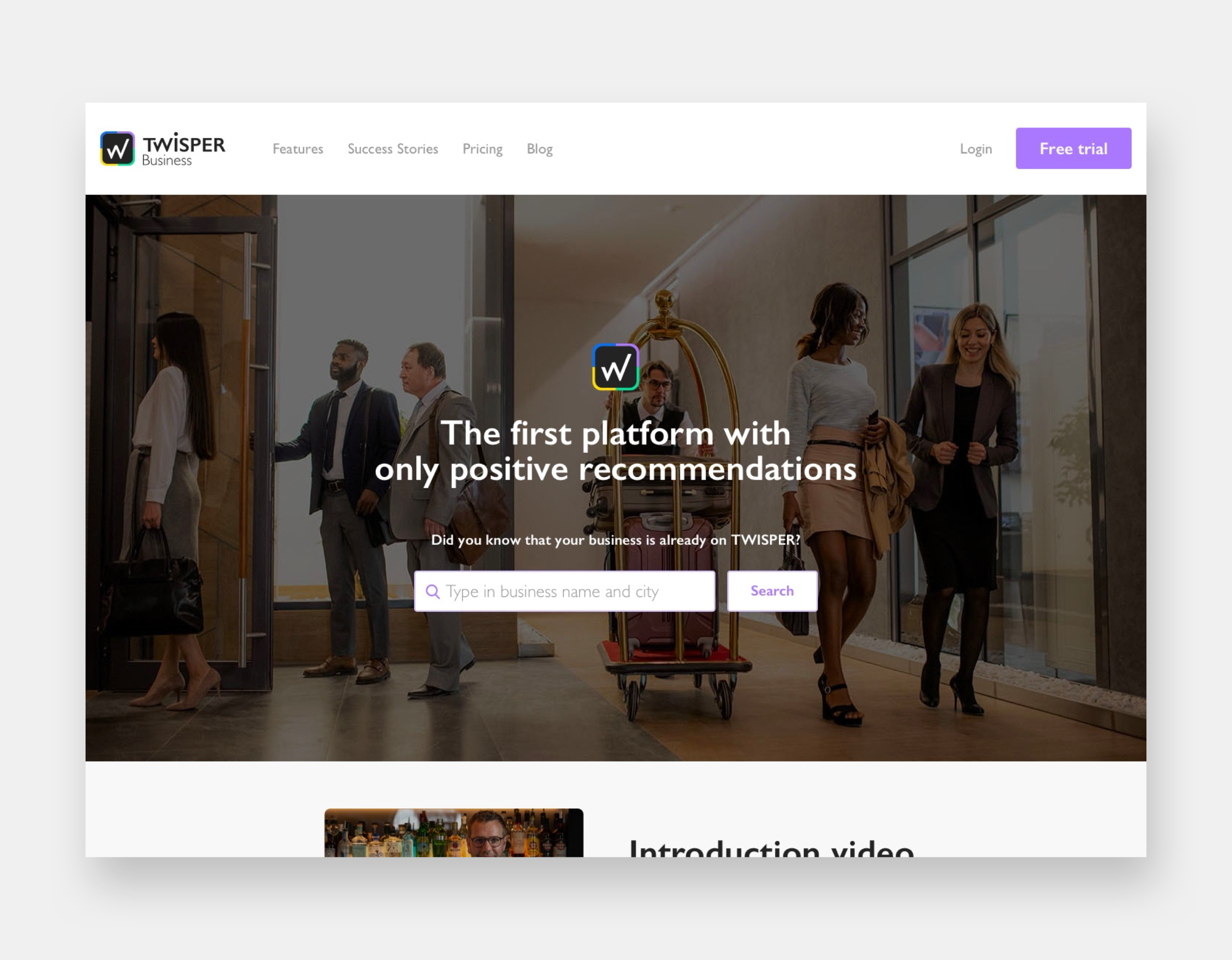
All contents that showcase costumers, partners or business owners experiences and testimonials are compiled in one page.

Old version
New site
Dirk Hany picture, which was present on the home of the previous site, is only recognizable by a restricted group of people, therefore relegated to secondary areas of the site.
Business Blog
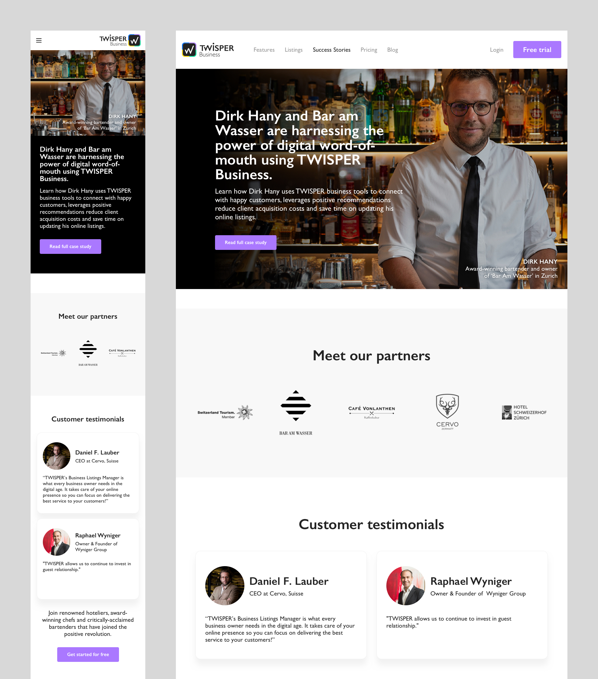
A mosaic blog page with valuable articles for target audience, improving link building and it helps drive traffic to TWISPER’s domains, into leads.
It also repurpose blog content for social media and build better relation with B2B audience.
Improving the Sign-up
Signing-up on a platform shouldn’t be tricky, it should be smooth and intuitive.
Therefore, we have taken into account some crucial points:
- Optimize claim flow content
-
Redesign forms and steps
- Improve onboarding experience

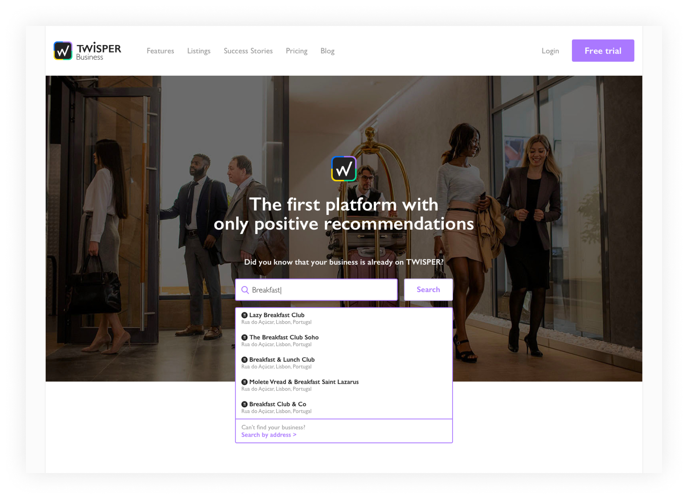
CTA button’s message
The message “Start Now” does not imply that claiming business is free for any users, so it made sense to change it to “Free Trial”.
A confused user is less likely to convert and leads to a poor user experience.

︎ Previous CTA button
︎ Current CTA button
Reduce noise and unnecessary forms

Imagery was covering over 85% of the screens.
The user experience is overloaded with graphic information or distractions. Clear screens are most prospective to get users to focus on main objectives
and goals of the experience.


Previous Claim Flow


Current Claim Flow
Making the claim flow seamless
We removed “Update Information” and “Scan Listings” steps from the Claim Flow and merge all forms on “Create Your Account” into a simple and clear single page system (all-in-one).

Overview of steps to complete Claim Flow
︎ Previous Claim Flow - 6 screens
︎ Current Claim Flow - 3 screens
All-in-one

1 of 3 steps
After finding and selecting the business, the user proceeds to the claiming process, where the registration forms are available on a single screen.
2 of 3 steps
The step to select the users business category was on the same welcome screen, meaning there are more steps in onboarding.

3 of 3 steps
The step to verify business is when the system connects the service to a business manager, thereby the final step.


UI clean up
UI clean up
The platform is often the homepage for subscribed users.
At its simplest, it should look slick, intuitive, and easily provide users with a global overview of distinct sections with access to the most important business settings, data, and functionalities.
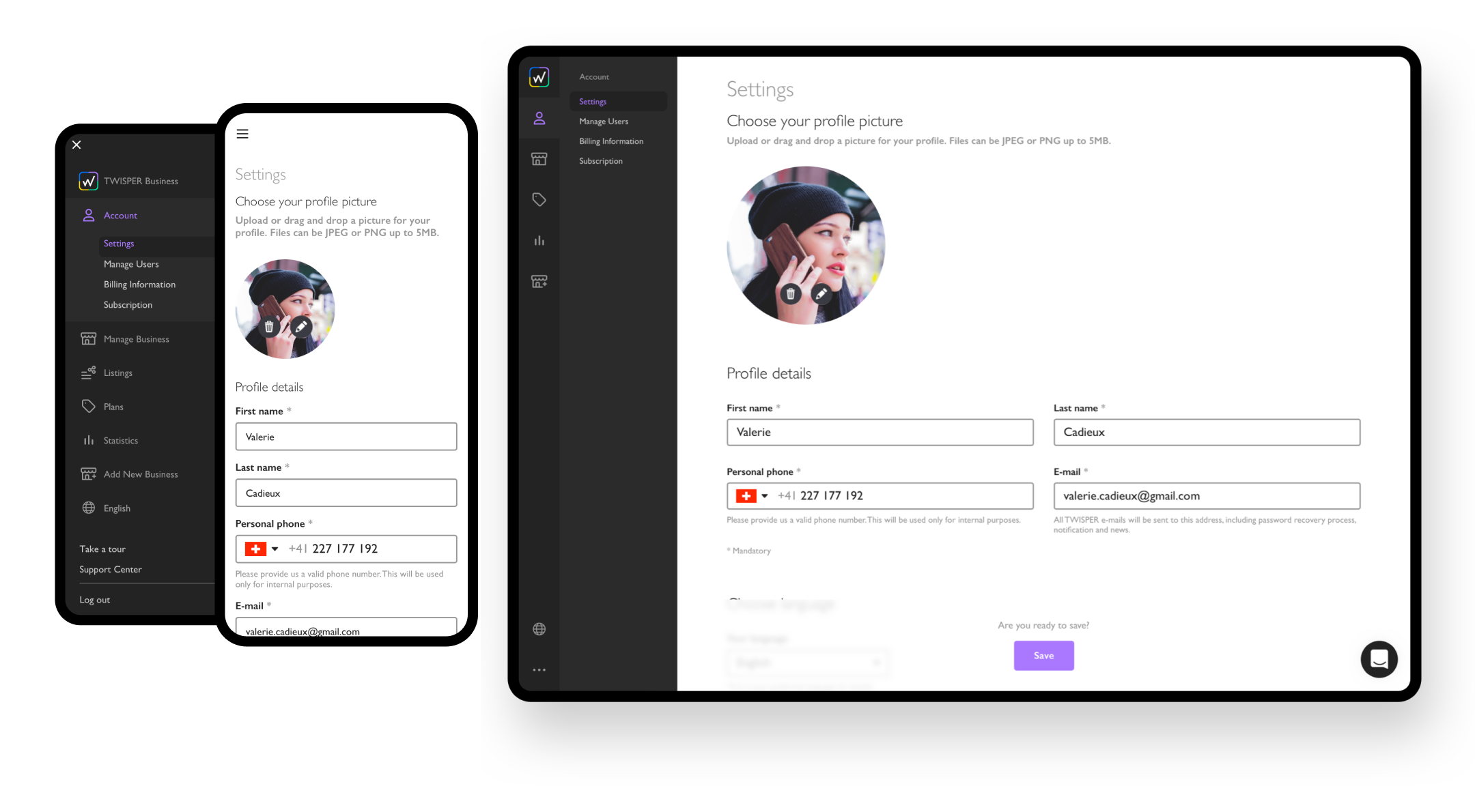
Bring up colors and contrast
High contrast colors typically grab the user's attention much more than dull colors.
The navigation system and key elements gain more presence when aligned with the brand's guidelines.


Using size and scale
The sidebar adjustments helped to emphasize visual hierarchy of elements and components on all screens and the responsive design allows adding more items on the menu without breaking the structure.
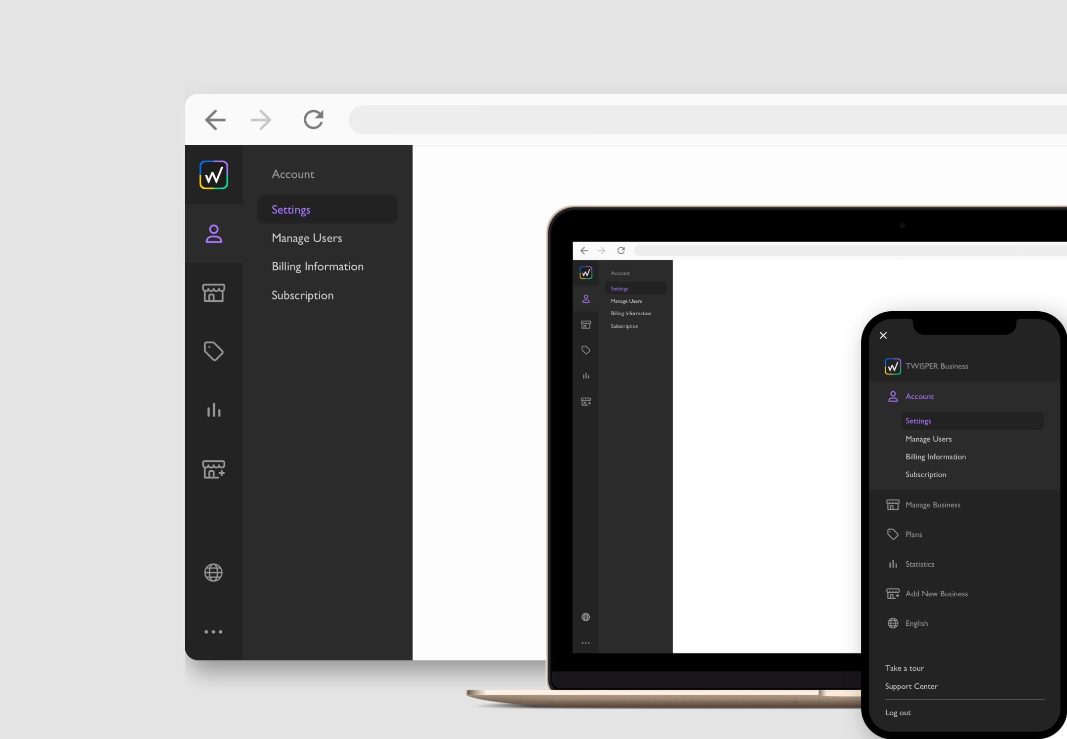
Optimizing navigation
By replacing the center page menu reduced the effort needed to navigate between different sections and subsections. It also reduced quantity of visible symbols and icons, allowing an ease experience.


Enhance viewing pattern (Z)
The Z pattern is a navigation path that most people are already subconsciously drawn to use. It follows left to right, zigzagging top to bottom, allowing information to flow and helping users scan through each element easily.

Reflections and Learnings
- Being first-timers on a Start-up, for many of us the design could change daily, so we felt great to deliver design solutions aligned with brand guidelines and successfully launching improved and updated products.
- We learned how to work closely with Marketing Team, Product Manager, CRM Specialist, Content Team, Developers, and QA.
- We also became more collaborative and proficient to engage with ideas and quick-fix solutions.
- We’ve managed to lower the number of people who were skipping the claim flow, had more business owners creating accounts.
- And an overall increase of users with the business yearly subscriptions.
Find out the results and overall impact. See conversions ︎
Vivilde℠ • UI/UX Designer currently based in Lisbon, helping brands and businesses interact better with their audience. About ︎