TWISPER App Pro Feature Case Study

Launched on iOs and Android in 2019, TWISPER core is based on positive values, community-driven and no selling of user data.
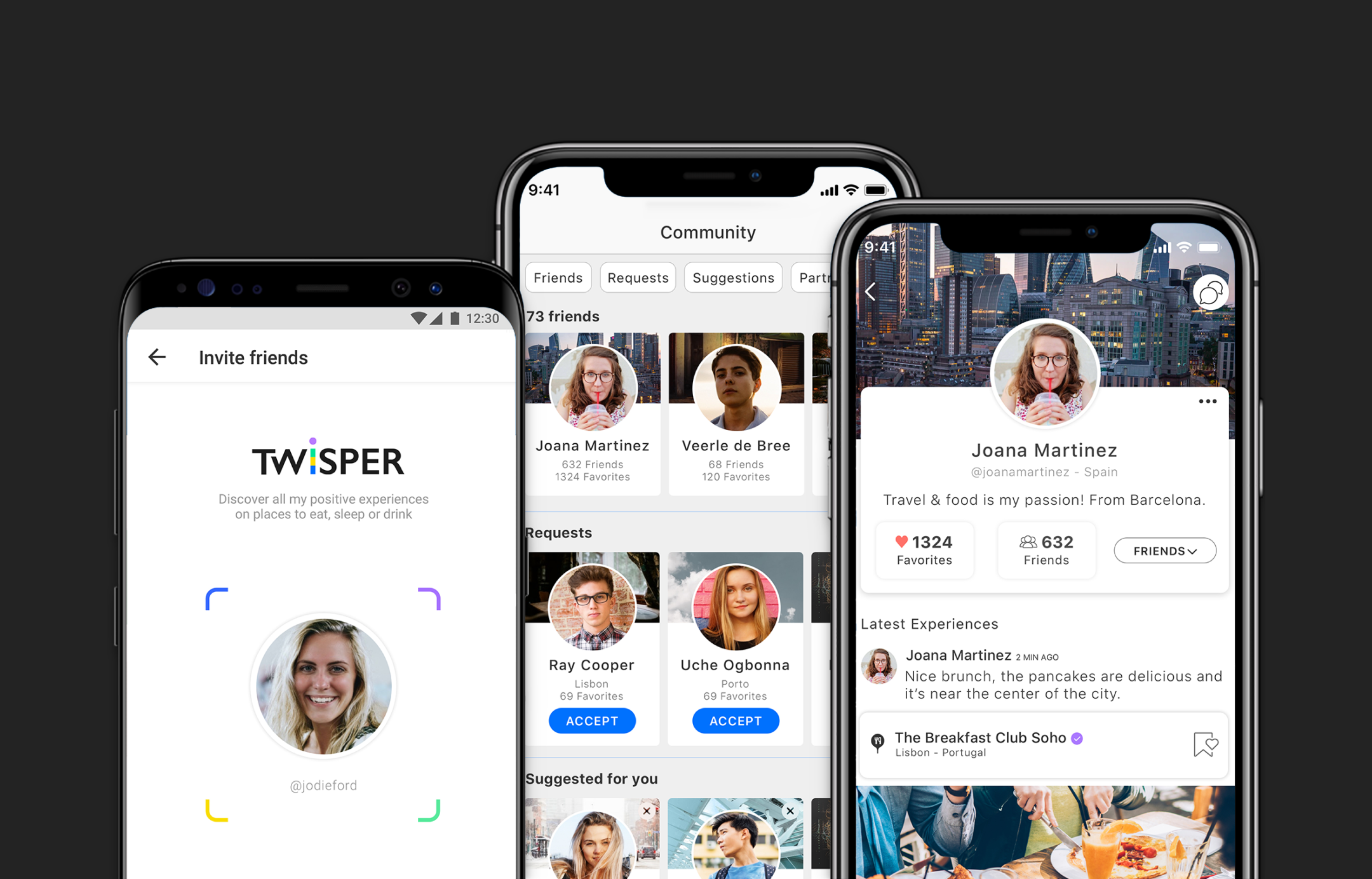
Search & Find VS Social Networking
On the one hand the challenge we had was to increase the possibilities of the app as a Search & Find tool and, on the other hand, to improve the social momento by reducing the initial effort for first-timers to create and grow a trusthworthy community.
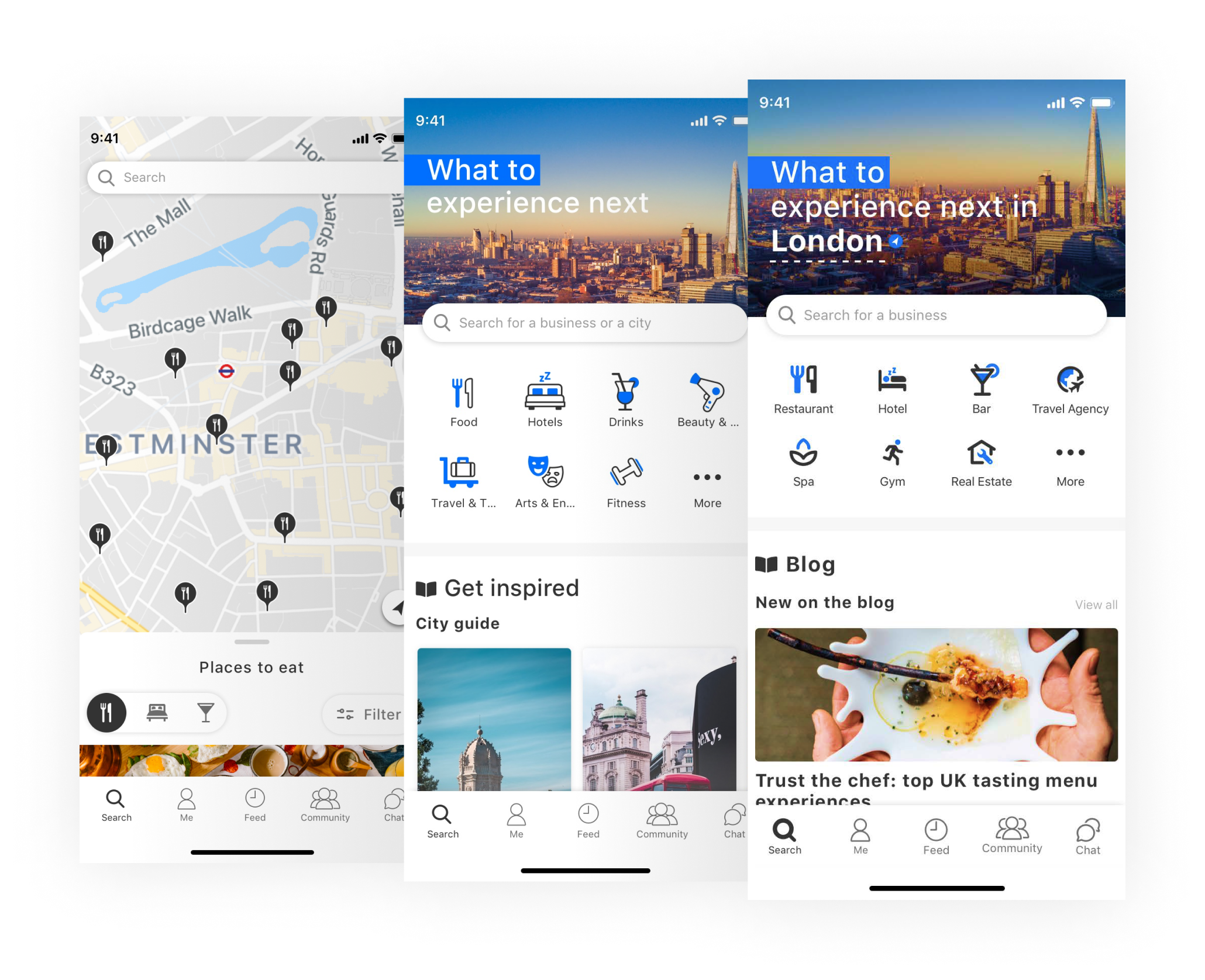
Following up
It was also asked to continue an initial proposal, which resulted in the development of new flows and assets that would fit on the Discover screen and echoing into the Pro feature.
Discover screen
Search page
What’s new?
- Immersive page experience
- Map as secondary feature
- Blog content based on location
- 7 Most Popular of 15 categories on display
- Quick access to all services
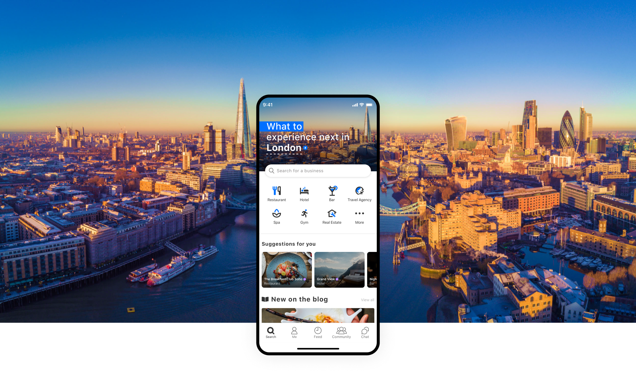
Cityscape
as hero images
Impactful backdrop image
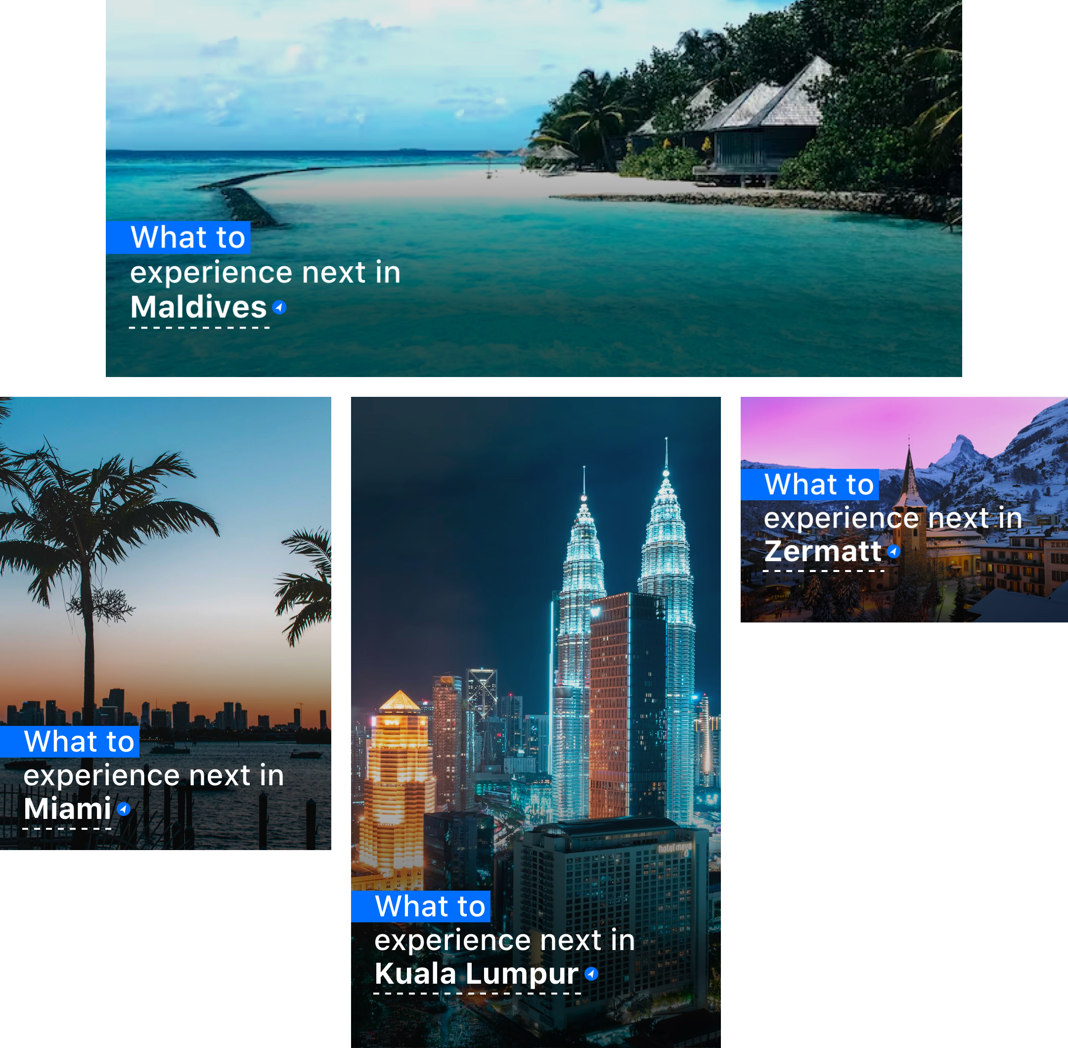
The cityscape image of the locations plays a key role in the look and feel of the Discover screen and the overall Search experience.
Either metropolitan or more natural areas, cityscape images are attractive and impactful because our brains recognize and relate better with visual contents.
Either metropolitan or more natural areas, cityscape images are attractive and impactful because our brains recognize and relate better with visual contents.
TWISPER for Newbies
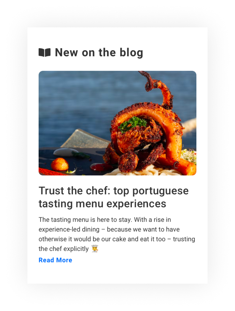
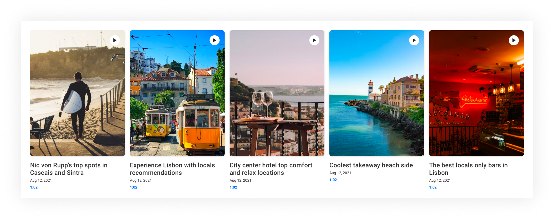
Newcomers can find awesome places with curated content – blog articles and community vlogs from foodies and travelers who shared their favorite spots.
Map in the background
Location first
The Discover screen gives users contents based on real time location, and they can discover hidden gems in cities around the world.
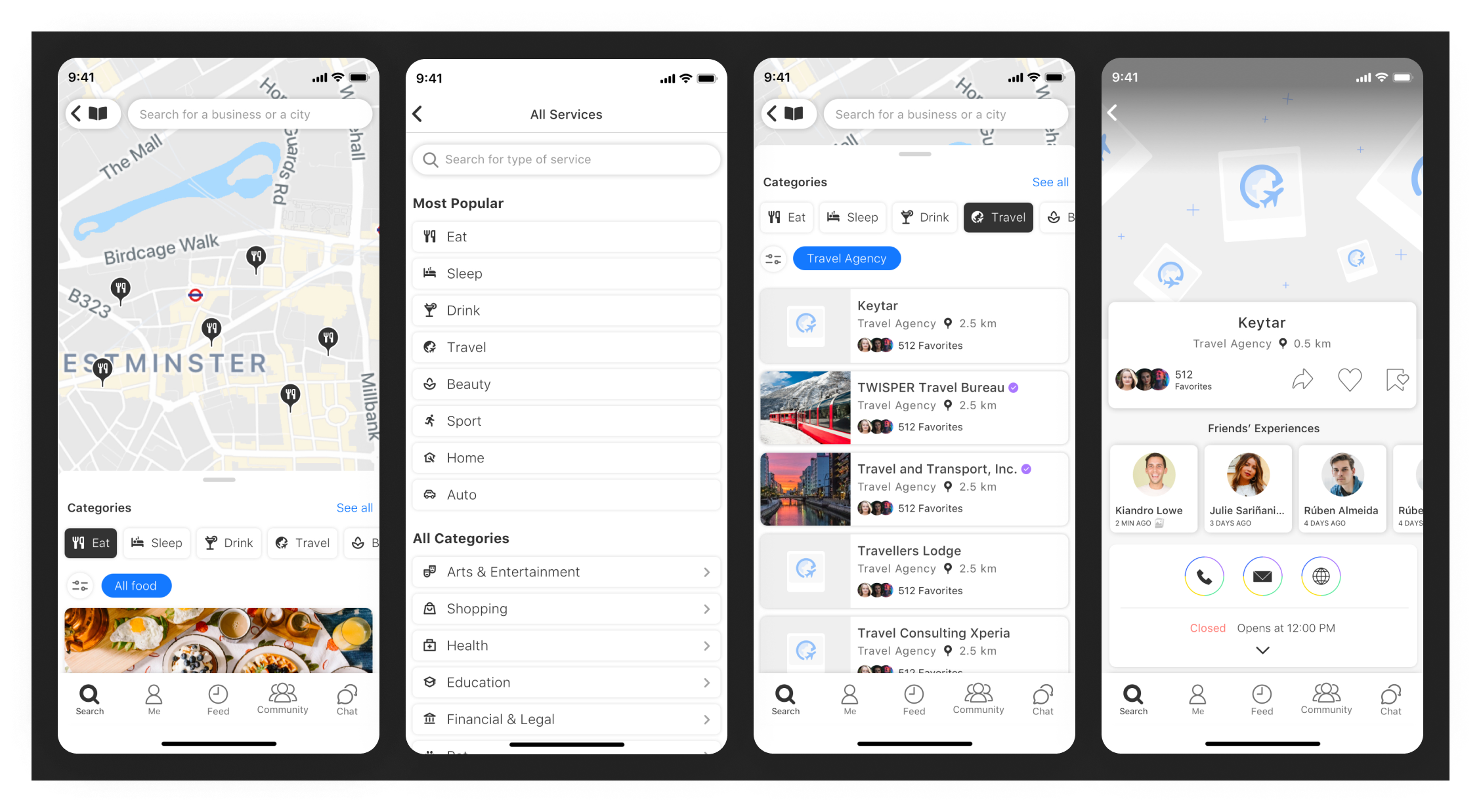
The map become less imperative to discover great places and most users take the map as a secondary feature, but remaining easily accessible.
The map become less imperative to discover great places and most users take the map as a secondary feature, but remaining easily accessible.

Listings
By selecting a category, users access a list of nearby places.
By selecting a category, users access a list of nearby places.
Map
Users can access the map feature by clicking the “Map” icon.
Users can access the map feature by clicking the “Map” icon.
Accessing all 15 categories and 96 services
Users can access a list with all 96 services types, and also browse for a
category or subcategory by clicking “More” button on Discover screen, “See all” button on the Listings screen and on the Map.
Icons Redesign



Category Icons
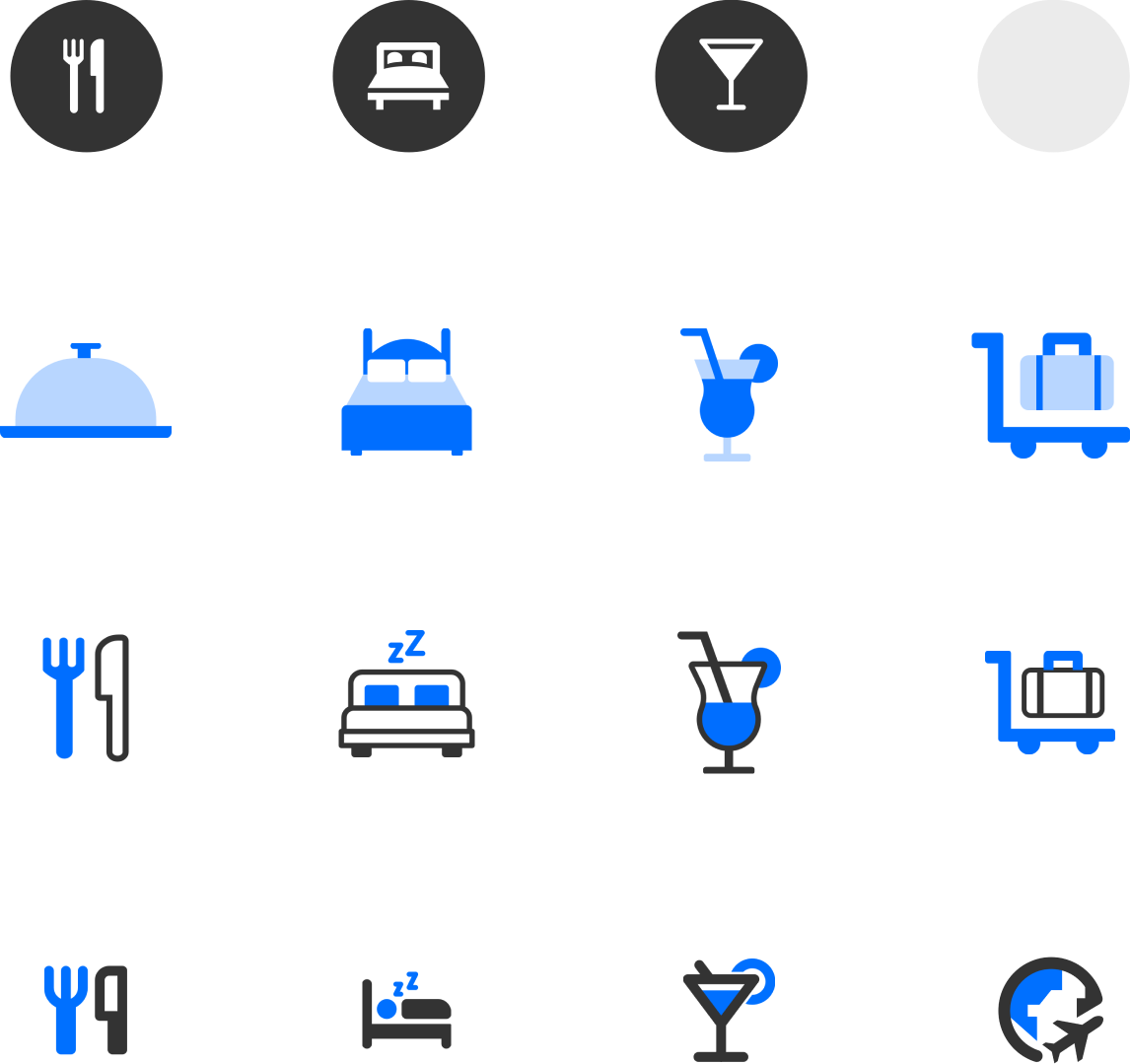
To embrace the new phase we carefully crafted designs that honor heritage and welcome the brand styleguide updates.
An improved custom made reference icons that define the object or an action through a strong analogy.
An improved custom made reference icons that define the object or an action through a strong analogy.
Icons Set in 5 possible usage
Filter icon, map pins, discover screen, empty state, and business (B2B environment).

15 categories
Eat, Sleep, Drink, Travel, Beauty, Sports, Home, Shopping, Arts & Entertainment, Auto, Health, Education, Financial & Legal, Pet, and Others.

Refining variables
and styles
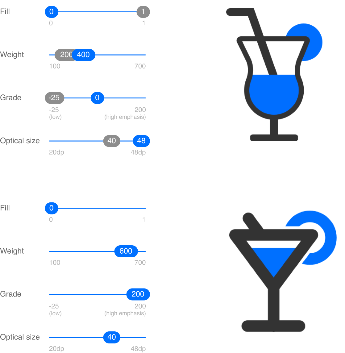
In order to achieve design consistency we reduced the wide range of design variants and unify weight, fill, optical size, and grade of all icons.
Navigation Bar
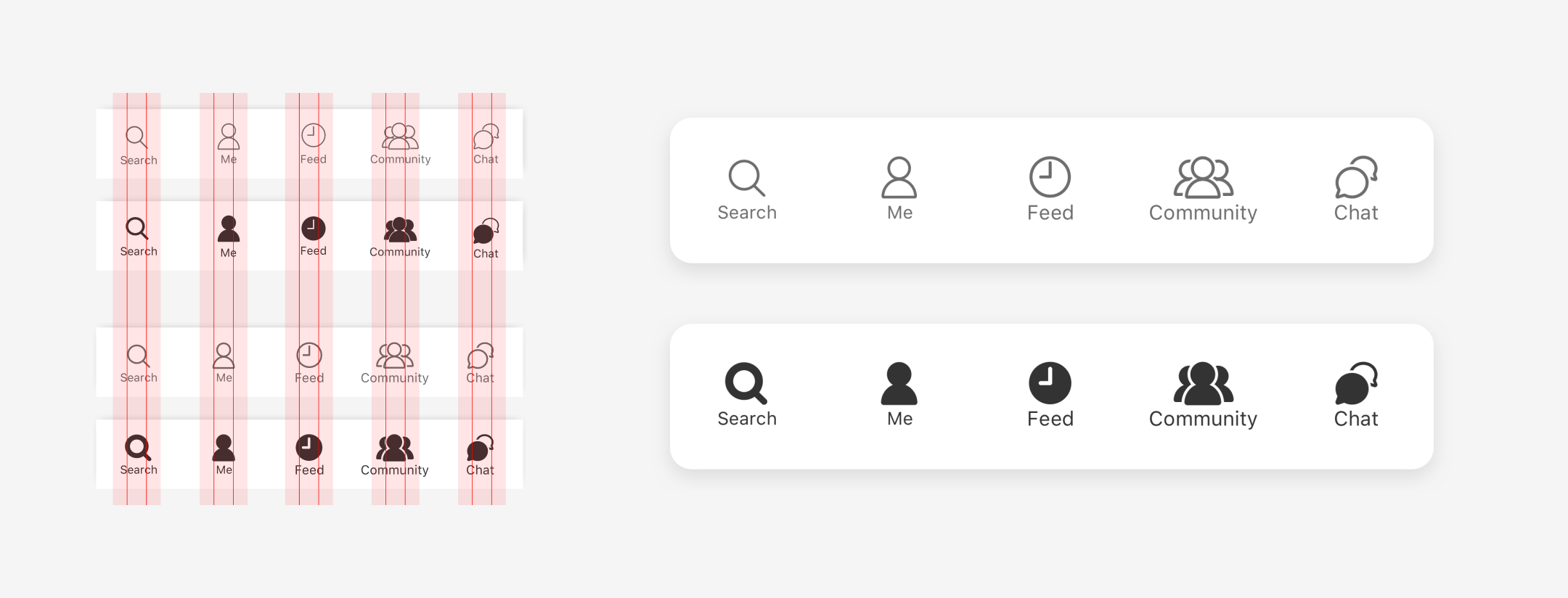
We also applied the same design principles on the icons from the bottom navigation bar and done improvements making it more detailed and seamless.
Sizes and layout
Standard icon layout, Icon grid and keyline and Optical icon sizes.
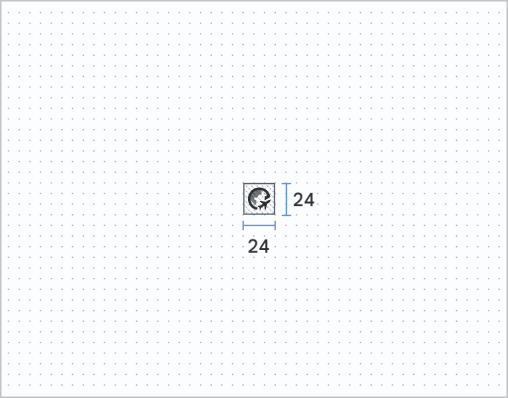
Standard icon size 24dp grid at 100% scale (baseline)
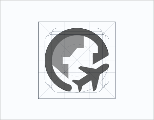
Keyline (circle, square, vertical and horizontal rectangles)
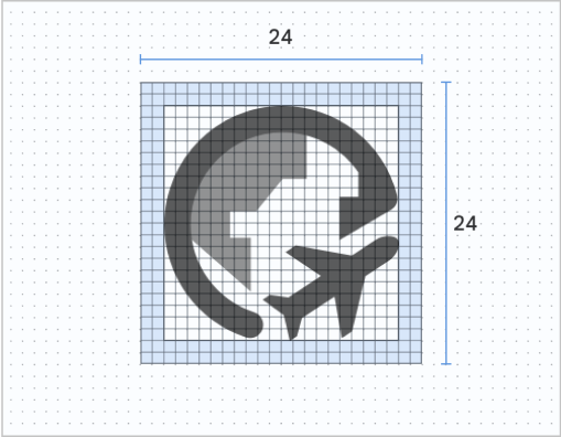
Standard icon size 24dp grid at 1000% scale (baseline)

Supported icon sizes: 20dp, 24dp, 40dp, and 48dp.
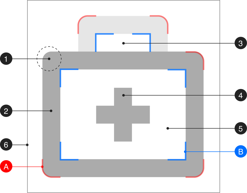
Metrics:
anatomy
and corners
1. Corner
2. Stroke
3. Counter stroke
4. Stroke terminal
5. Counter area
6. Bounding area
A. Exterior corners (2dp radius)
B. Interior corners (0dp radius)
TWISPER Web App
Accessible everywhere, any screen, any device.
A browser-based app and native system
The main goal for the web version was to reflect the app experience on mobile devices, and keep it responsive as a computer-based extension of the TWISPER App.
We have also introduced a ovelayed prompt pop-up screen to let users know that there’s an app for a better experience.
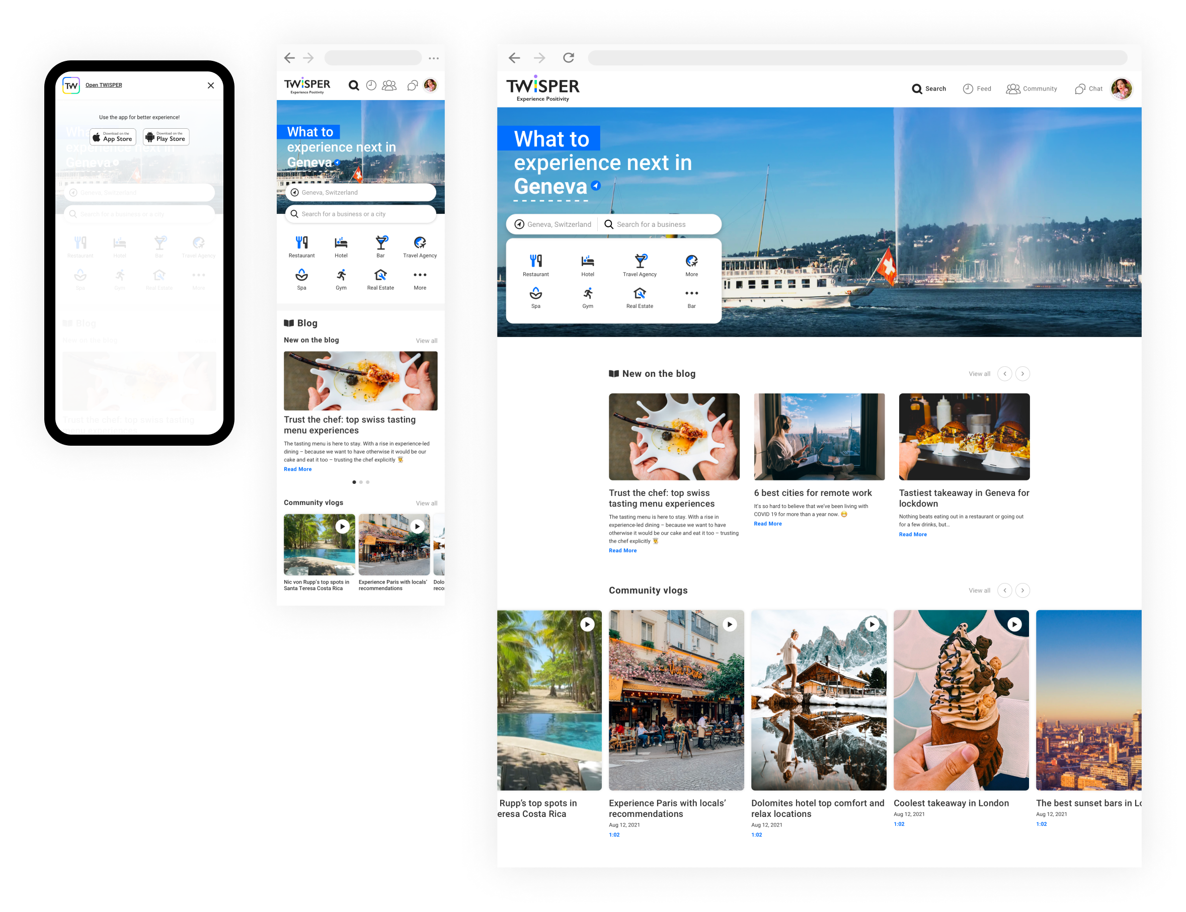
Developing native app to fit operating systems:
- Continue to use the app seamlessly
- Multiple devices linked to one account
- Optimized for desktop operating system
- Increased navigation speed
Location first
TWISPER Web App estimates where you are from your IP address.
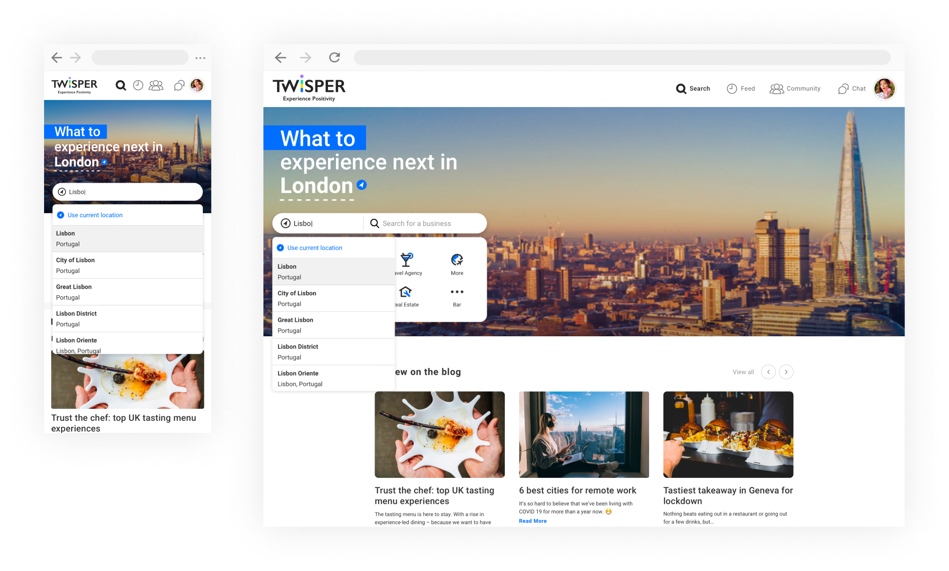
New location
Users can search for locations or Enable Location Services on browsers.
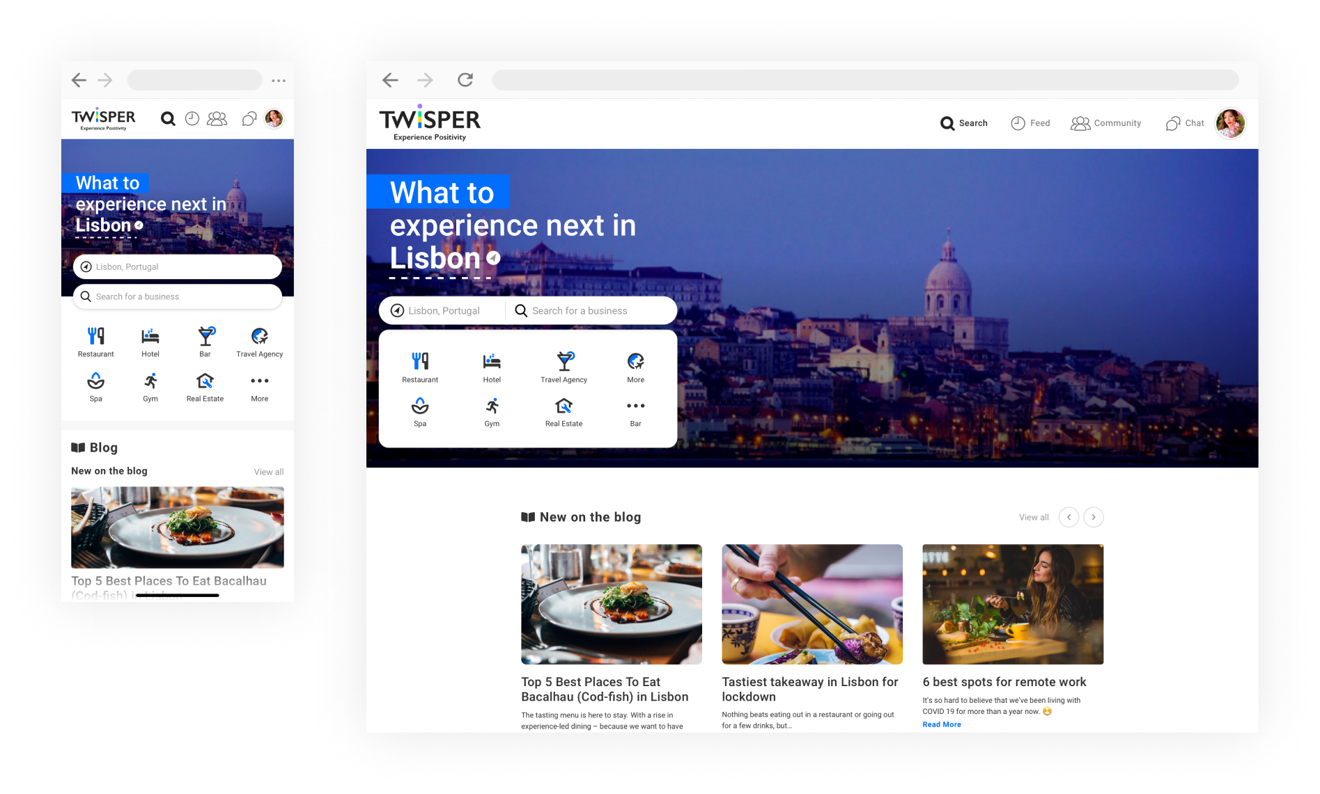
Search places
Autocomplete search for business are based on users locations, most favorited, and past searches.
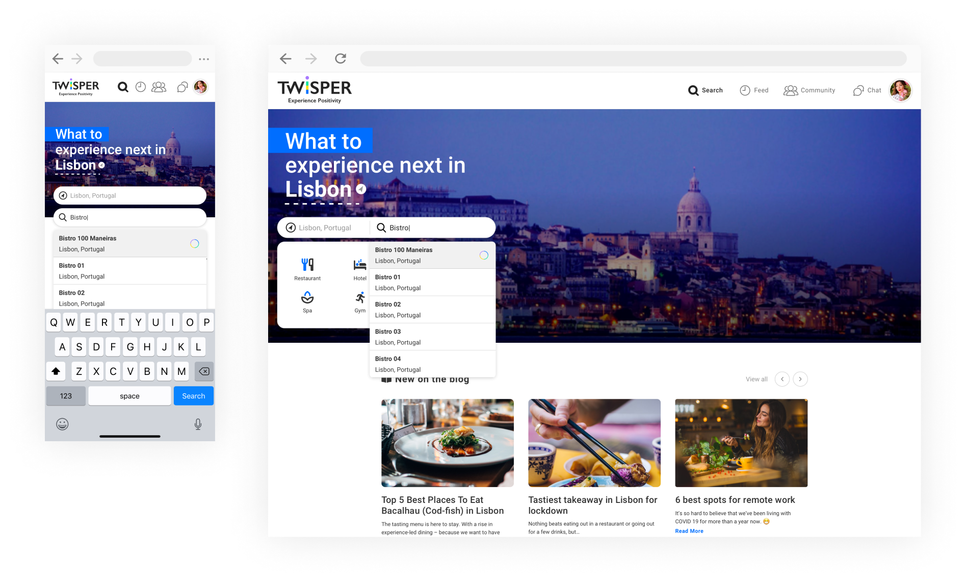
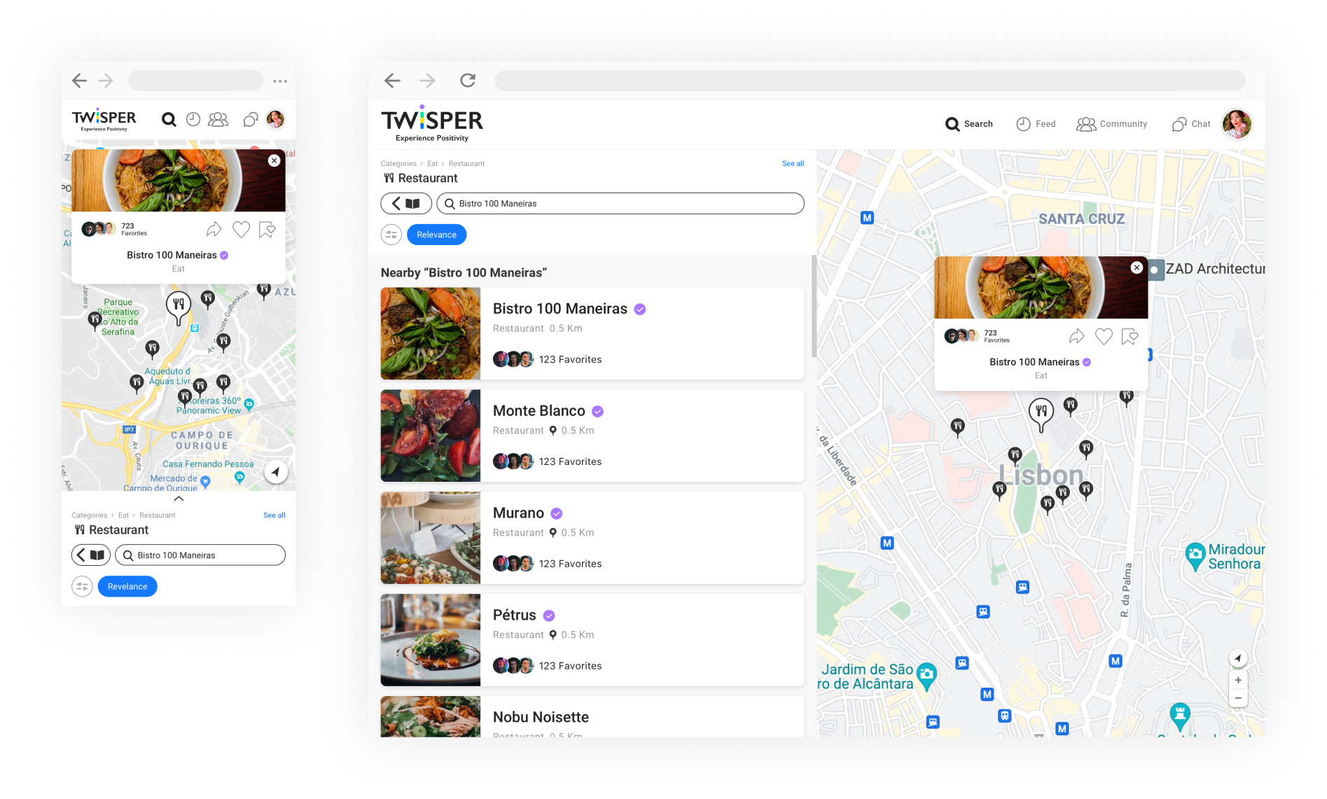
Search results
The search result list is shown in the side panel along with the map (is not secondary in web version).
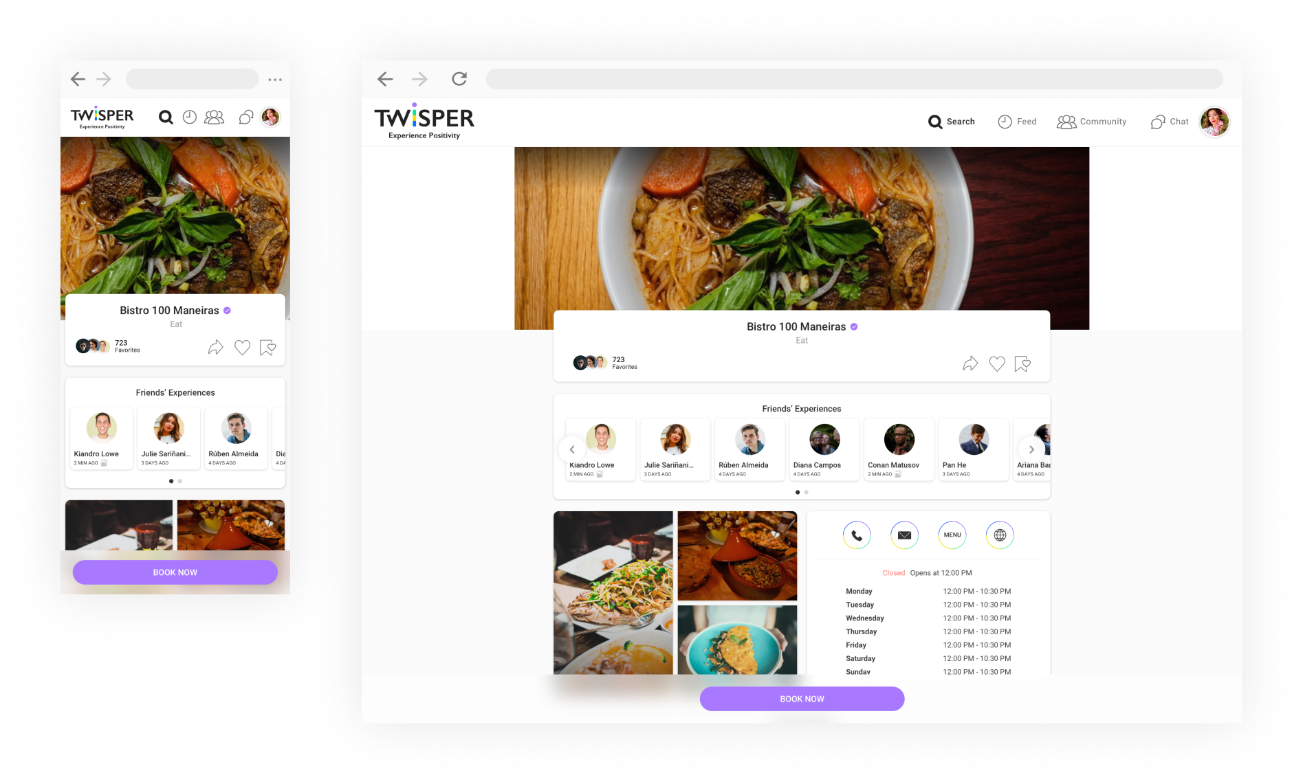
Place details
Business profile page with adjusted UI, displaying more widely all the place details.
UX Reviews
User Centric
When the app experience impacts people every day — we think carefully about how users feel.
User-centered design sets a creative approach to problem solving: it starts with people, and ends with individual and innovative new solutions rooted in people’s actual needs.
When the app experience impacts people every day — we think carefully about how users feel.
User-centered design sets a creative approach to problem solving: it starts with people, and ends with individual and innovative new solutions rooted in people’s actual needs.
Anytime, Anywhere
Either planning an experience or discovering an awesome new spot for quick bite — people want and need more trusted services either on leisure or daily basis.
The app working seamless anytime, anywhere, therefore it was developed for iOS and Android systems, and also the Web App.
Either planning an experience or discovering an awesome new spot for quick bite — people want and need more trusted services either on leisure or daily basis.
The app working seamless anytime, anywhere, therefore it was developed for iOS and Android systems, and also the Web App.
Service-oriented App
The application is composed largely of services, which are often in a hierarchy.
The top level services are displayed as most popular, and contains more interactions and normally higher demands from consumers and end users.
The application is composed largely of services, which are often in a hierarchy.
The top level services are displayed as most popular, and contains more interactions and normally higher demands from consumers and end users.
Check out the detailed user flows on the Discover screen. See flows ︎
Vivilde℠ • UI/UX Designer currently based in Lisbon, helping brands and businesses interact better with their audience. About ︎