Sketch, Photoshop, Zeplin
2020
TWISPER Business B2B Platform
Featured
Marketing,
Product Manager, CRM Specialist
Art Director, Design Lead
iOS + Android + Web Devs, QA
iOS + Android + Web Devs, QA
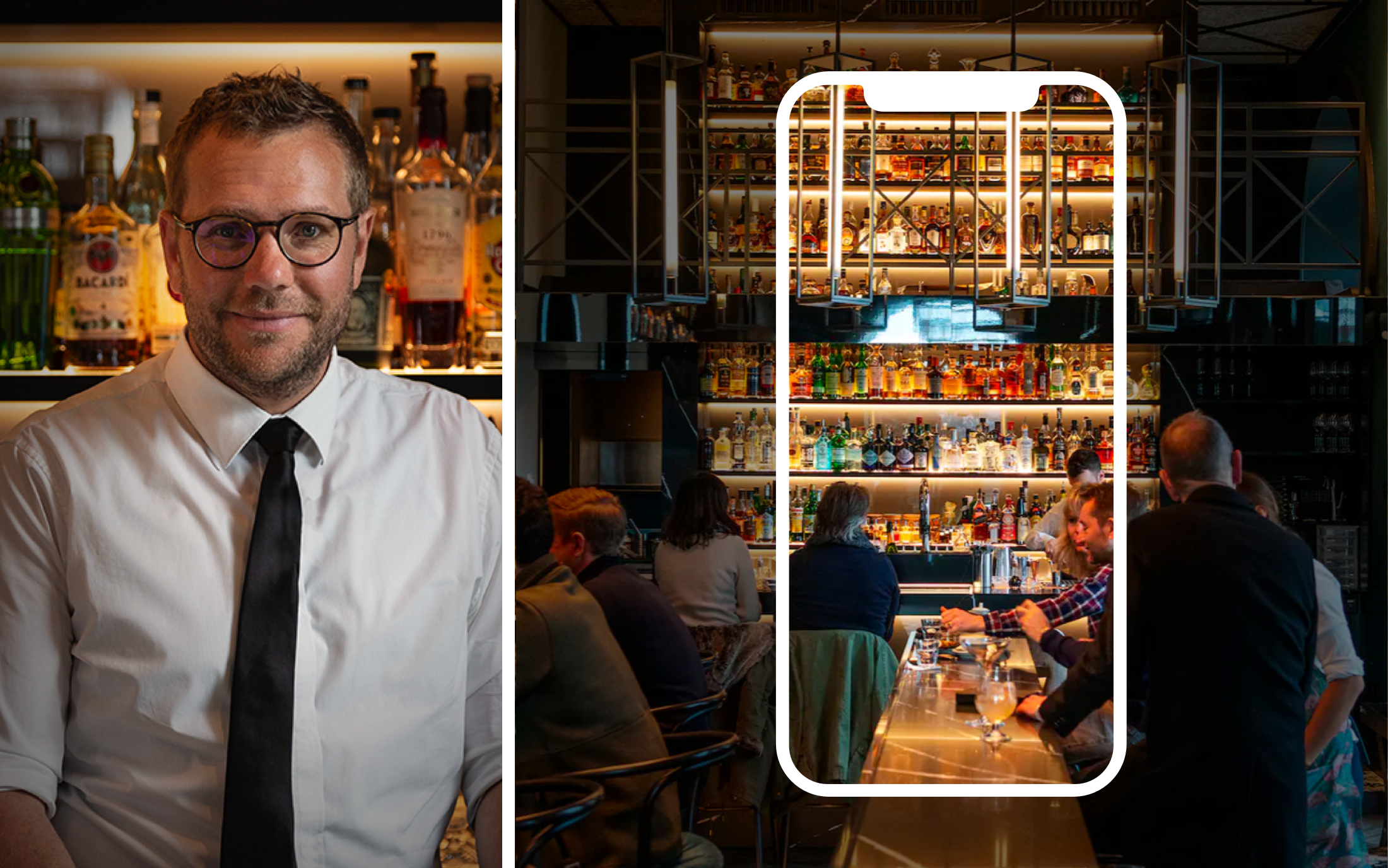
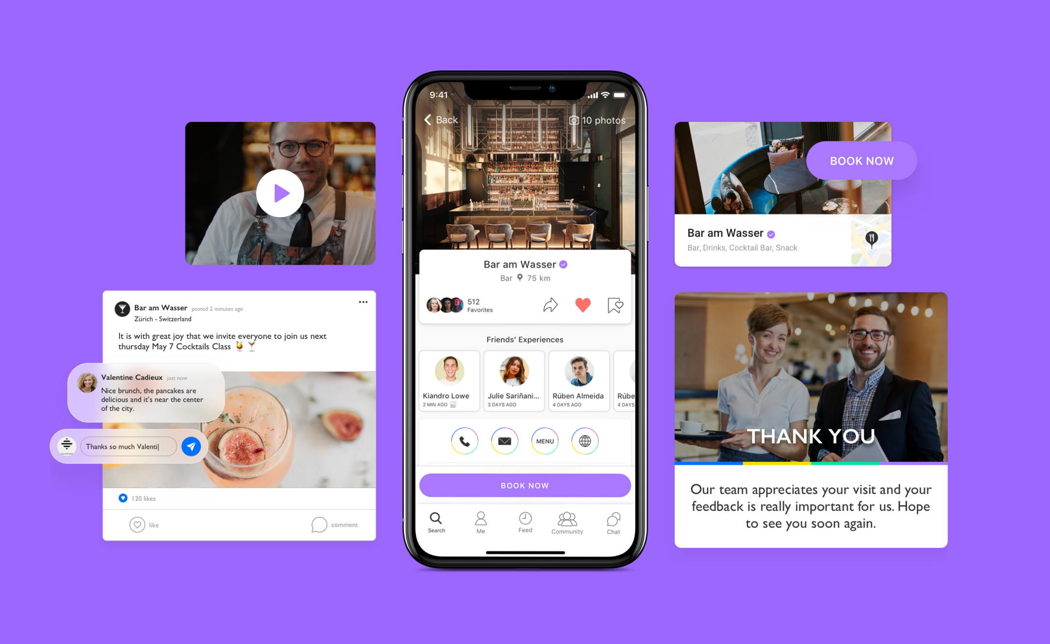
TWISPER Business provides professionals tools to leverage their online image and boost revenue by attracting new clients.

Less is more
Objective
The main goal was to improve the overall digital experience and interface on the TWISPER Business website and platform based on the updated brand guidelines.
Also, to increase the conversion rates, by managing user interface design and tracking the effectiveness of UX strategy.
Also, to increase the conversion rates, by managing user interface design and tracking the effectiveness of UX strategy.
Solution
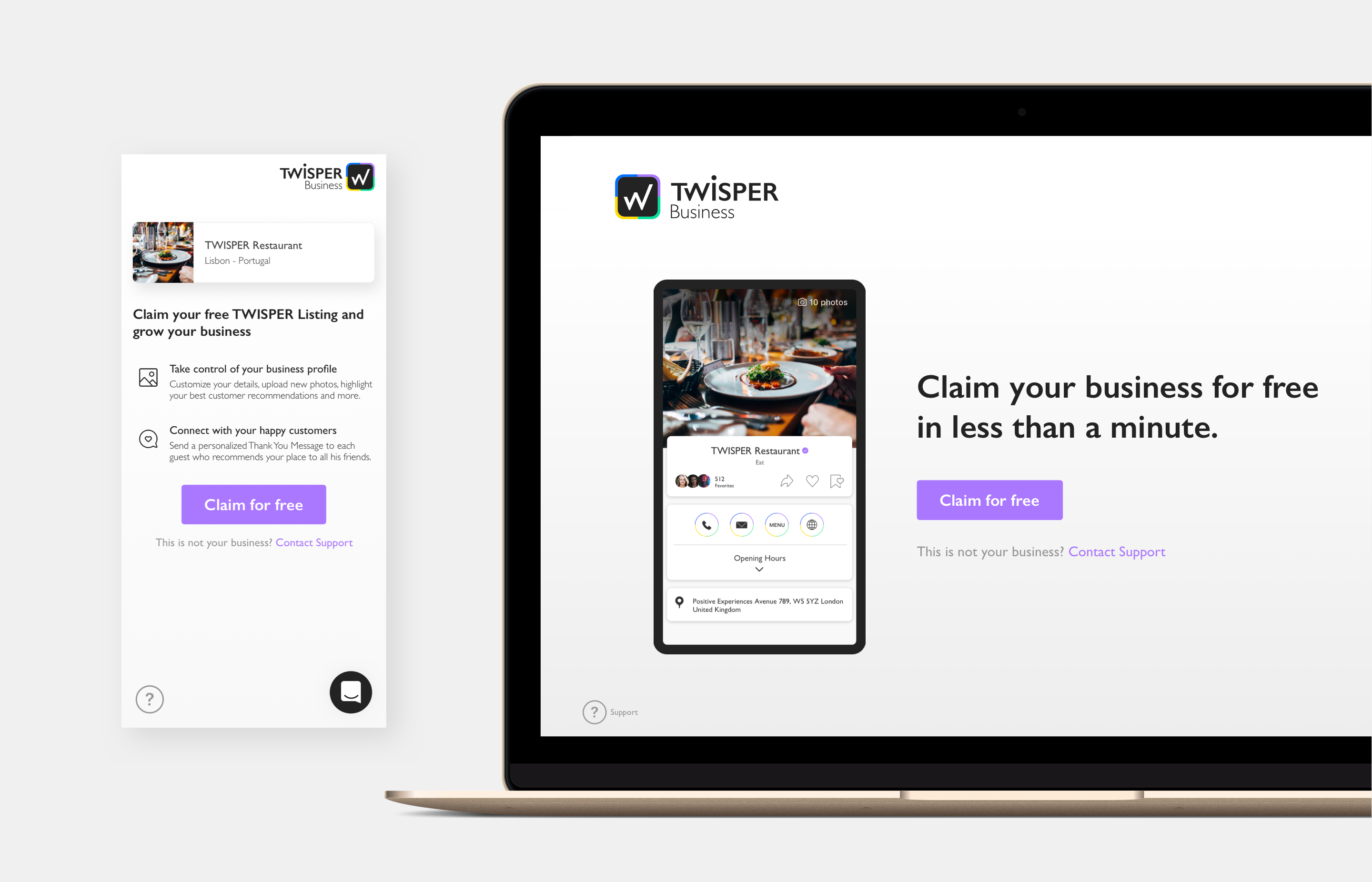
Present TWISPER Business through a B2B narrative while radiating the updated corporate identity, yet deliver a flawless claim flow experience that translates less drop-offs to potential subscribers.
Join TWISPER Business anytime, anywhere
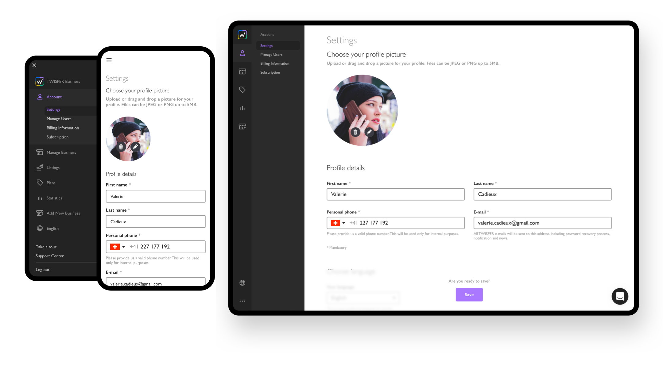
With TWISPER Business audience being busy managers, our priority was to make sure the onboarding worked seamlessly on any device and browser.
We carefully designed the experience to adapt to different screen sizes, ensuring that users could enjoy the subscription effortlessly, whether they were at work, home or on the go.
We carefully designed the experience to adapt to different screen sizes, ensuring that users could enjoy the subscription effortlessly, whether they were at work, home or on the go.
Clear Landing Page
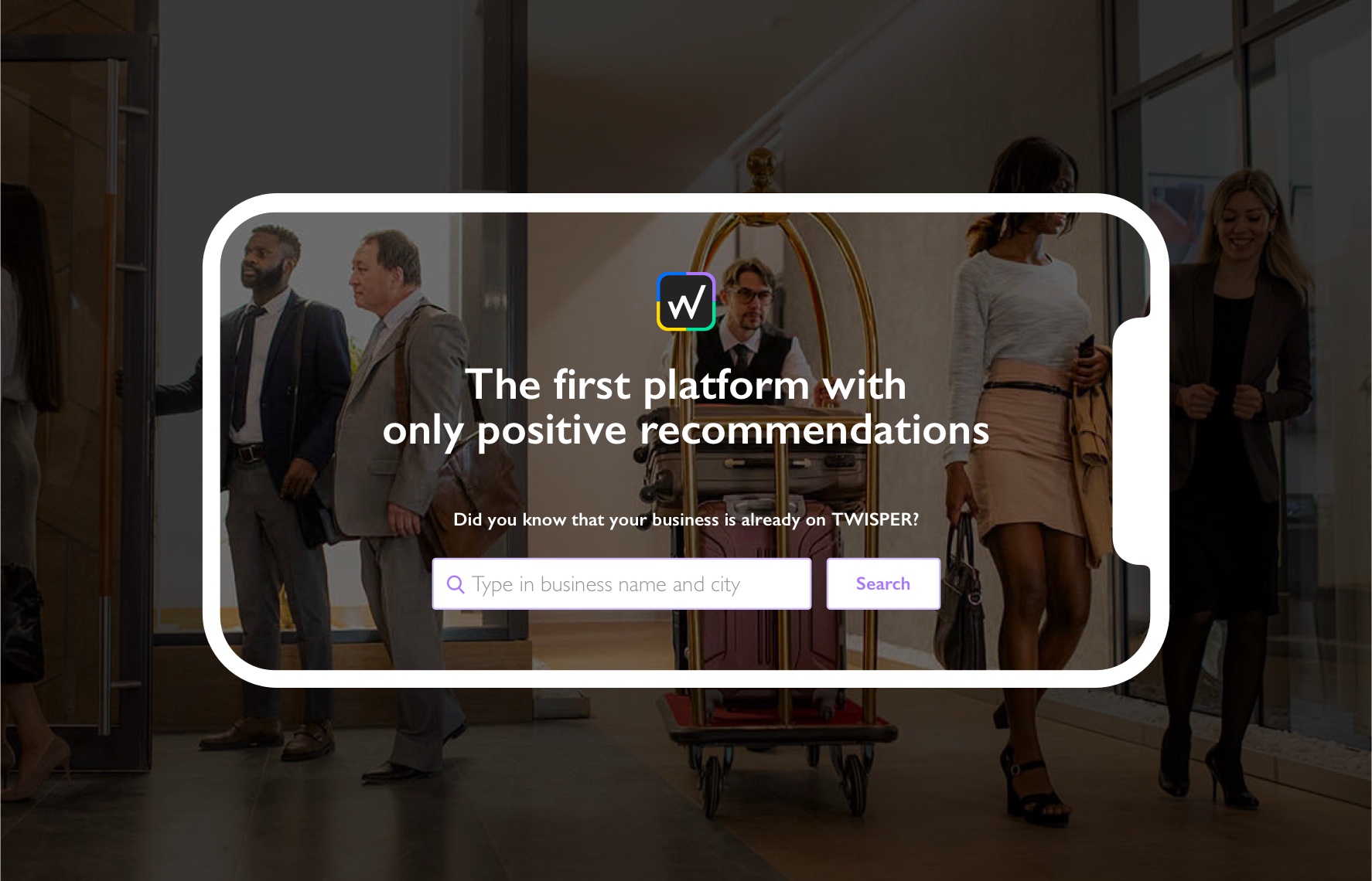
We've optimized and redesigned the landing page and improved the onboarding experience making the sign-up on the platform more intuitive and smooth.

Clean Interface
The TWISPER Business Platform is naturally the homepage for subscribed users, so we’ve made it more clean, sleek, and easy access to key business settings, data, and functionalities.
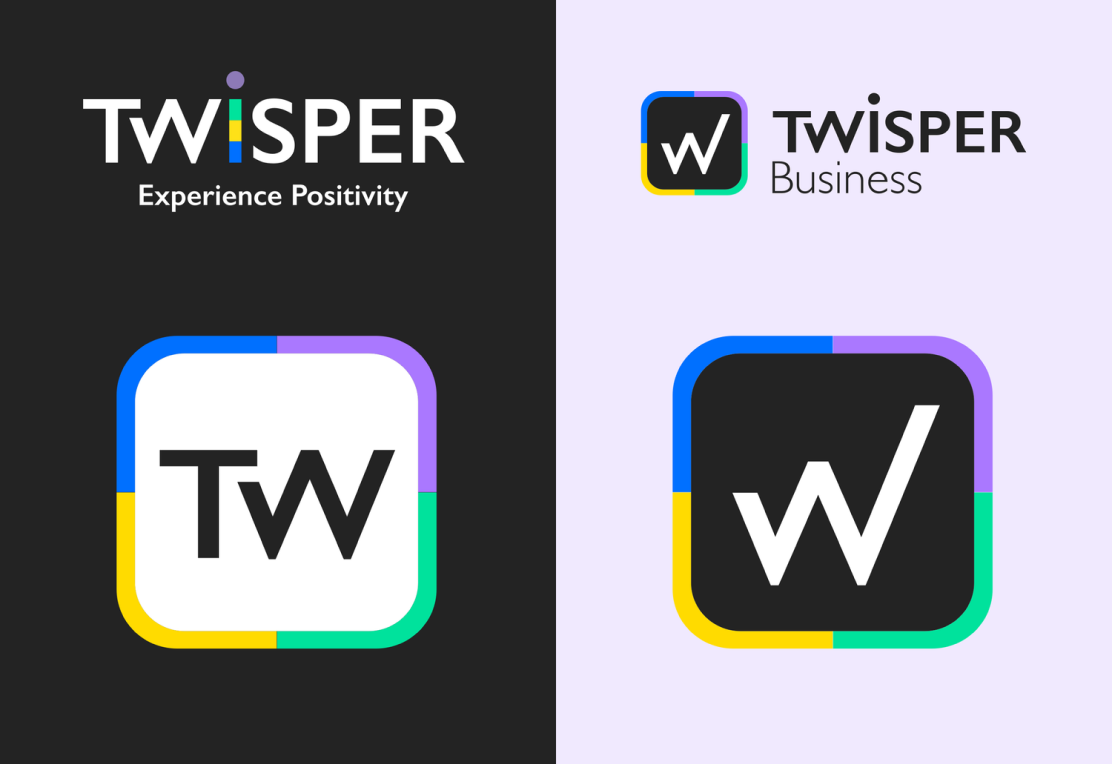
Matching
B2C/B2B Visuals
Design System and UI more aligned with TWISPER B2C Products.
Find more about this project.
Case Study ︎
Vivilde℠ • UI/UX Designer currently based in Lisbon, helping brands and businesses interact better with their audience. About ︎